Category: Color Consultation & Color
Explore color consultation terms for undertone, color type, contrast, color harmony, palettes, and personal color direction. Learn how to choose shades that support your complexion, wardrobe, and visual impact.
Color Consultation and Personal Color Analysis
This category covers the core vocabulary of color consultation and personal color analysis. It explains how color temperature, depth, clarity, and contrast influence the way colors interact with your complexion, hair, eyes, and overall presence.
These terms help you understand why one shade of blue can make the face appear clear and rested while another feels overpowering, dull, or disconnected. The aim is not to label colors as universally good or bad. It is to identify the versions, combinations, and intensity levels that feel coherent on you.
What This Category Covers
Use these glossary entries to understand:
- Undertone , including warm, cool, neutral, and olive tendencies
- Color Temperature , or whether a shade reads warm, cool, or neutral
- Color Type and Color Typology as systems for describing harmonious color directions
- Contrast , including the visible difference between your features and within an outfit
- Light-Dark Contrast , Hue Contrast , and Warm-Cool Contrast
- Color Harmony , Color Palette , and Color Profile
- Color relationships such as Analogous Colors , Complementary Colors , and Tone-on-Tone
- Color qualities including Saturation , Lightness , Muted Colors , and Clear Colors
How to Use Color Consultation Terms
Start by observing color close to your face. A shade may look attractive on a hanger yet have a very different effect when it reflects onto the skin. Notice whether your complexion appears more even, your eyes more defined, and your features more present, or whether the color seems to dominate you.
Compare similar shades rather than judging color names in isolation. Warm beige, cool taupe, soft greige, cream, and off-white can all look subtle, but each has a distinct temperature and visual weight. The same applies to blue, red, green, and pink.
When testing a color, consider the full context:
- daylight and indoor lighting
- hair color and skin undertone
- glasses, jewelry, and makeup
- the contrast level of the complete outfit
- fabric texture and sheen
- colors already present in your wardrobe
This makes color choices more practical than relying on a single seasonal label or a trend shade.
Why Color Harmony Matters in Outfits
Color affects first impression before details such as cut or accessories are fully noticed. A coherent palette can make a simple outfit look intentional, while an unsuitable color relationship may distract from good fit and quality.
Understanding your color direction can make wardrobe planning easier. It helps you choose neutral colors that work across seasons, identify useful accent shades, and create combinations with more confidence. It can also reduce bad purchases, especially when shopping online or building a Capsule Wardrobe .
Color harmony does not require matching everything perfectly. A considered Accent Color , a controlled Color Clash , or a strong Pop of Red can work beautifully when the overall contrast and mood feel balanced.
Practical Focus: Compare Shades, Not Just Color Names
A useful personal color analysis looks beyond broad labels such as “blue suits me” or “I cannot wear beige.” Instead, compare variations.
For example:
- A deep navy may feel more harmonious than a bright royal blue.
- A softened berry tone may work better than a clear fuchsia.
- Cream may feel gentler than pure white.
- Olive may be easier to wear than a yellow-based green.
- Dusty rose may create a calmer effect than a vivid pink.
The right choice depends on the relationship between the shade and your natural coloring, as well as the message you want the outfit to communicate.
A Practical Starting Point
Begin with these foundational terms:
- Color Type for your broader personal color direction
- Undertone for the warm, cool, neutral, or olive quality of the skin
- Contrast for the intensity and visual difference in your features and outfits
- Color Temperature for choosing warmer, cooler, or neutral shades
- Color Harmony for combining colors with clarity and intention
ESKYNA Key Line
Color consultation is not about restricting your wardrobe. It gives you a clearer way to choose shades that support your features, style message, and everyday wardrobe.
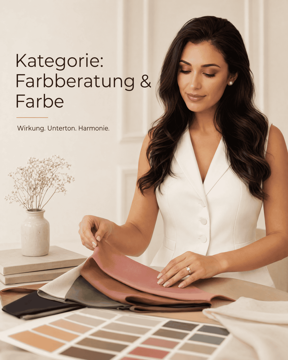
Color Consultation & Color 65
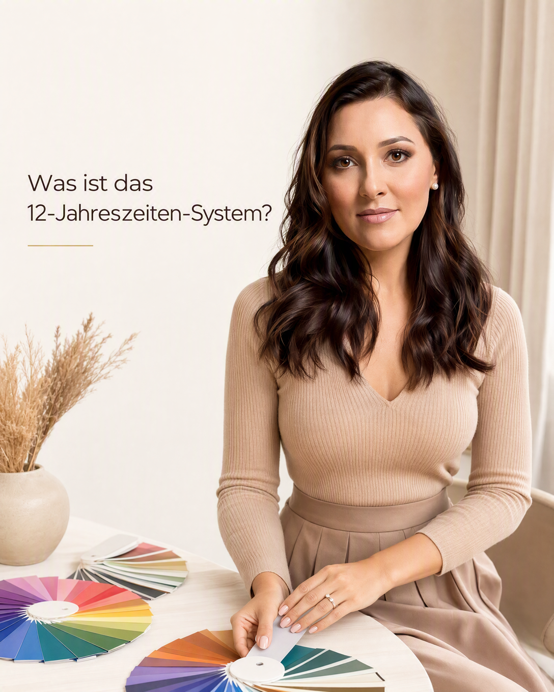
12 Season Color Analysis 12 Season Color Analysis is a detailed personal color system that groups coloring by undertone, lightness, depth, and saturation. It helps you identify clothing colors that create a more harmonious, clear, and natural appearance.
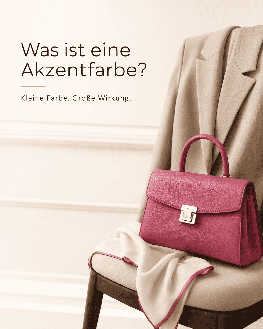
Accent Color An accent color is a deliberate, smaller color highlight that adds focus, contrast, or energy to an outfit. It can appear in accessories, shoes, makeup, prints, or one garment.
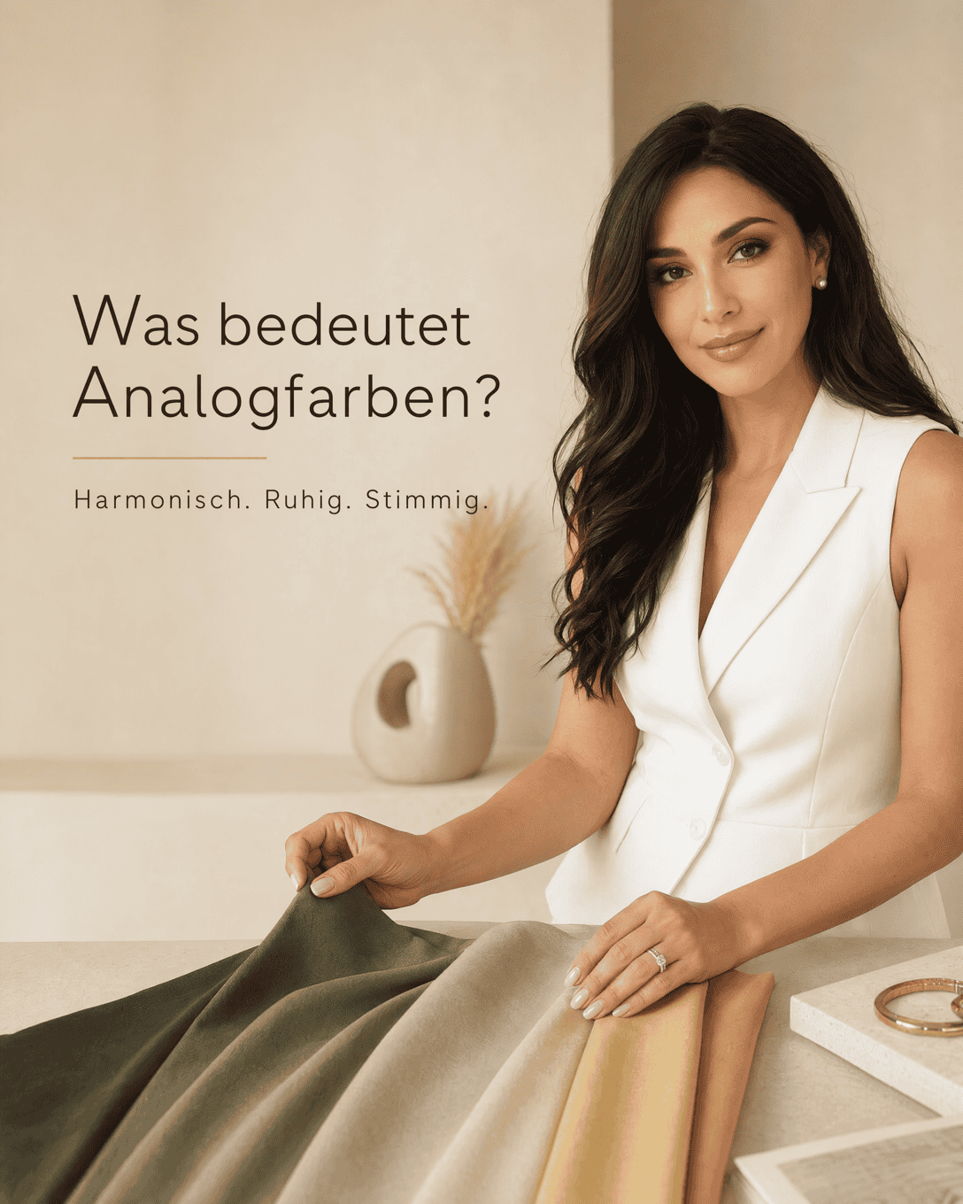
Analogous Colors Analogous colors are neighboring hues on the color wheel. Learn how to combine them in outfits for harmonious, low-contrast color palettes.
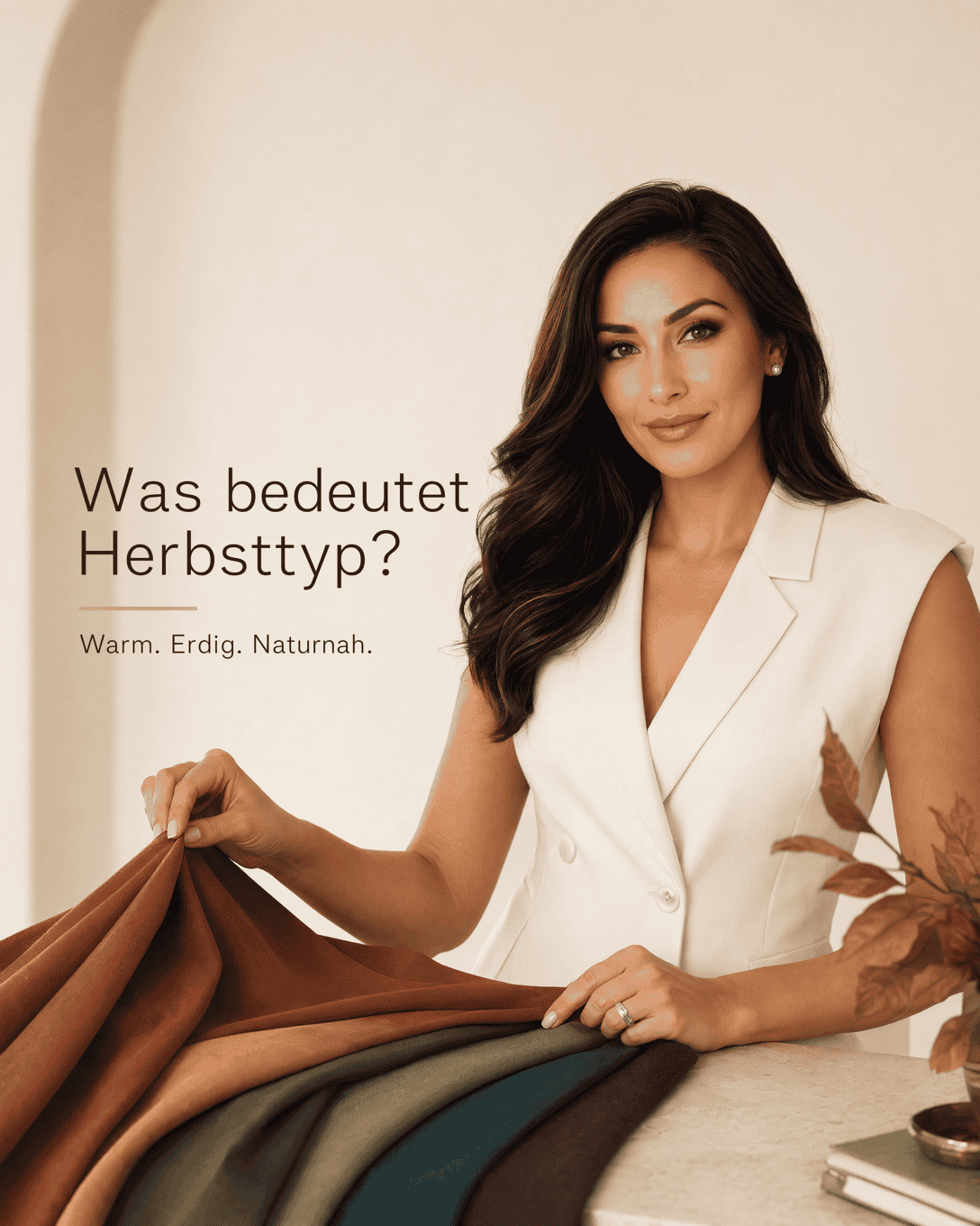
Autumn Color Type Autumn Color Type is a personal color analysis category associated with warm, muted, and often deep color directions. It helps identify clothing colors that can create a harmonious, grounded effect near the face.
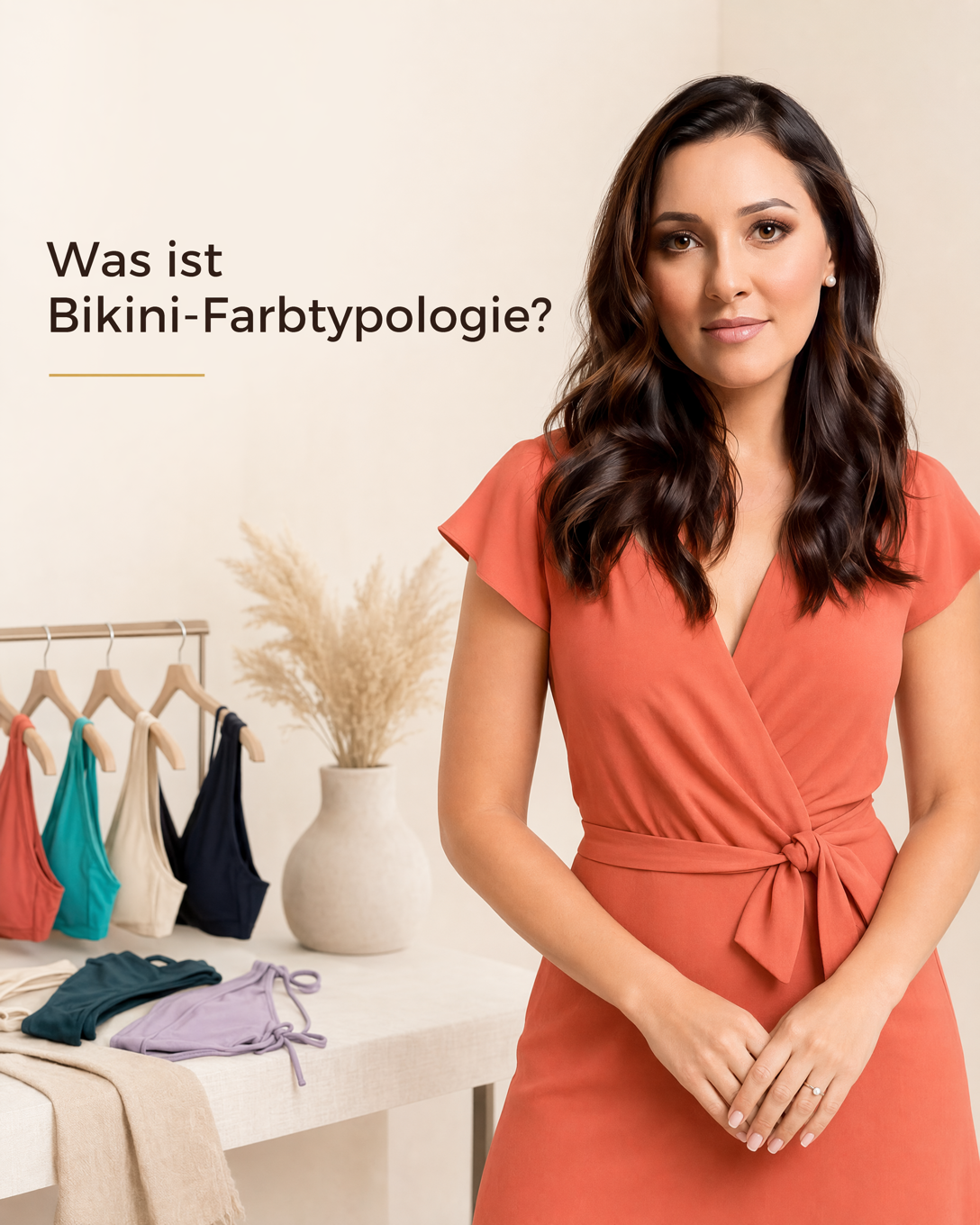
Bikini Color Typology Bikini color typology is the practice of choosing swimwear colors that harmonize with your skin undertone, both before and after tanning. It helps you find bikini shades that make your complexion look clearer, fresher, and more balanced.
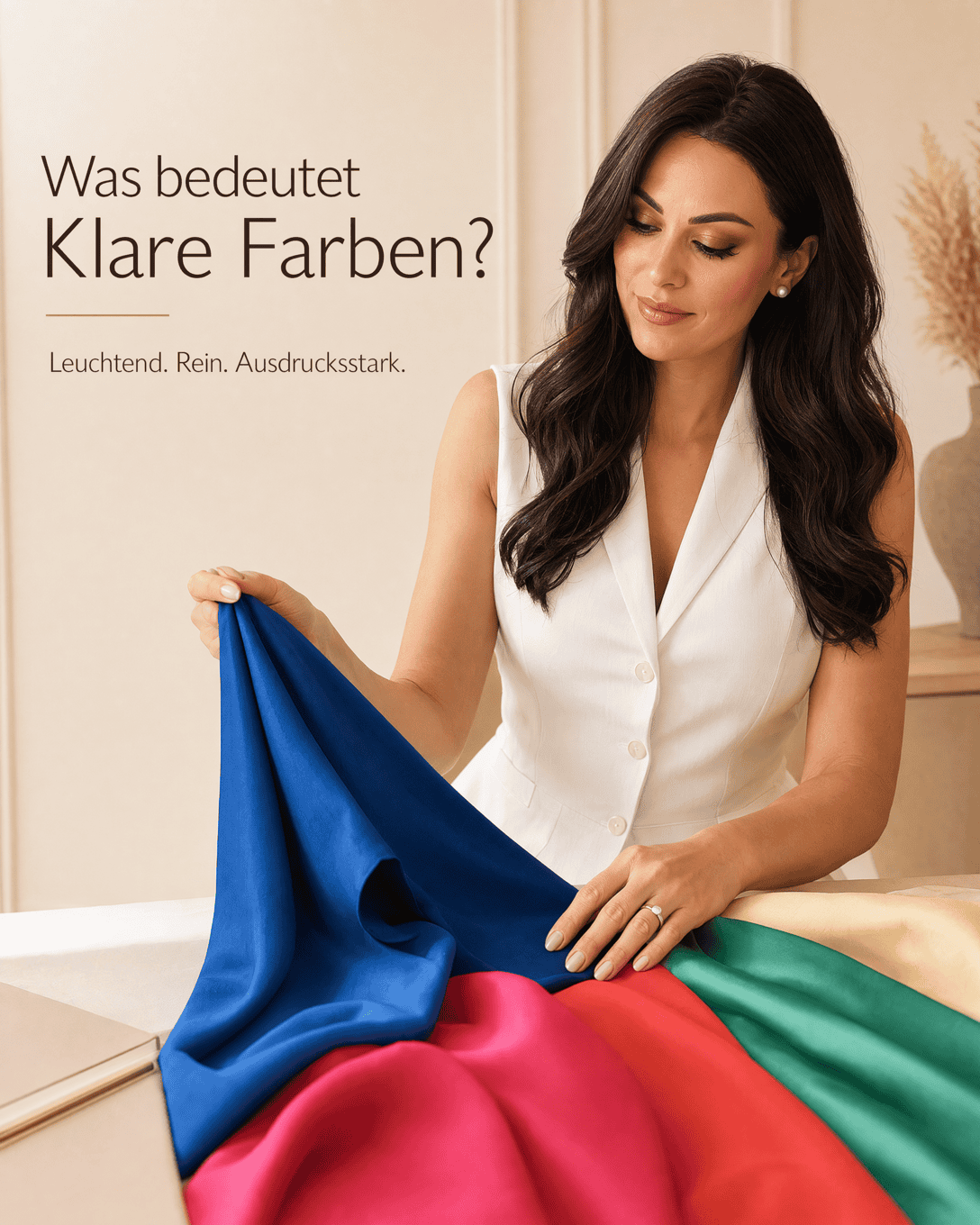
Clear Colors Clear Colors are bright, pure-looking shades with little gray, brown, or muted softness. Learn how clear colors affect personal coloring, contrast, and outfit harmony.
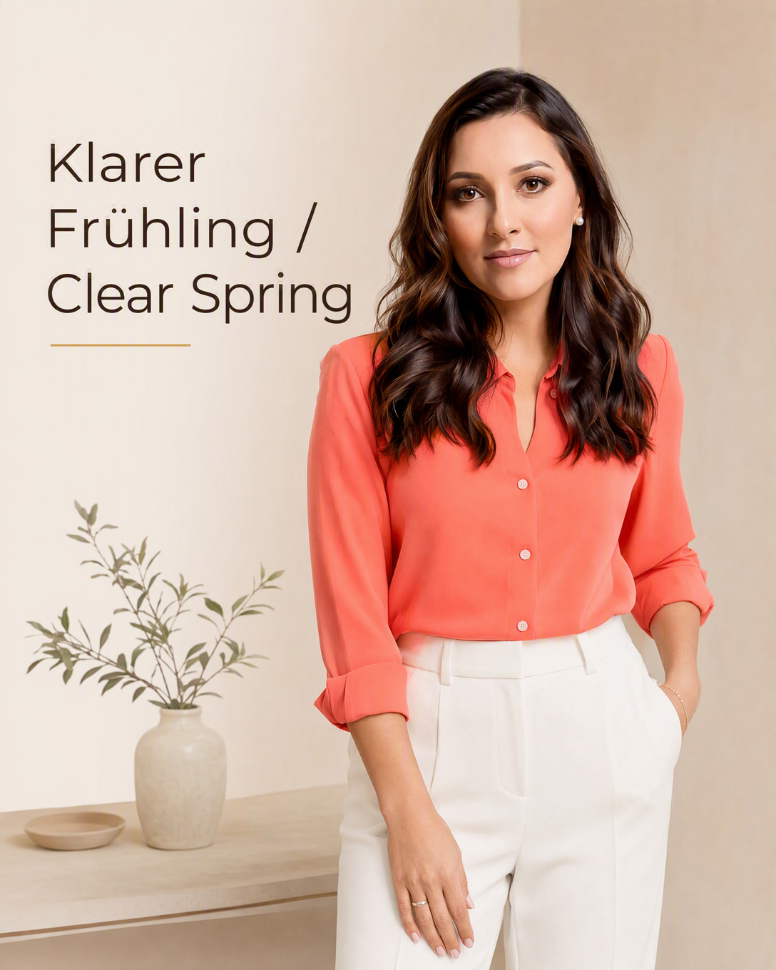
Clear Spring Clear Spring is a warm, bright, high-contrast color type in seasonal color analysis. It is usually suited to fresh, clear, energetic colors rather than dusty, dark, or heavily muted shades.
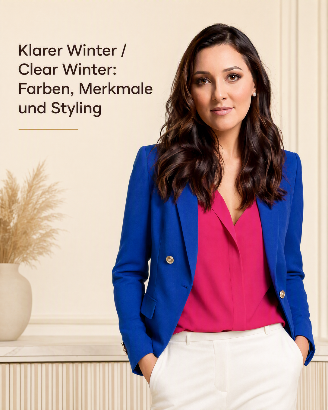
Clear Winter Color Type Clear Winter is a cool to neutral-cool, bright, high-contrast color type in the 12 season color analysis system. It is typically supported by pure, vivid, and visually crisp colors.
Cloud Dancer Cloud Dancer is a soft, pale white color name used in Pantone color systems. Learn how this light neutral affects undertone, contrast, outfit harmony, and personal color choices.
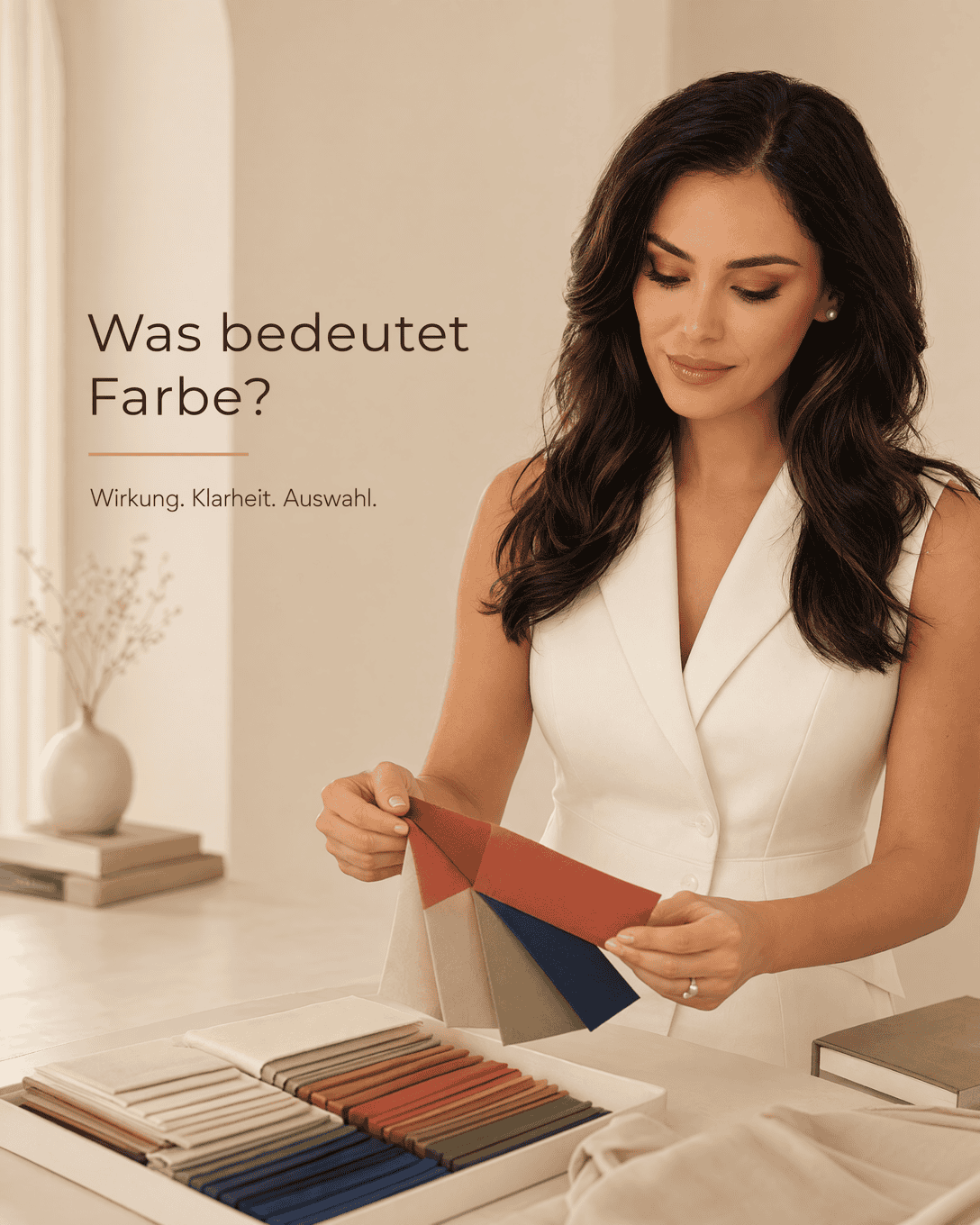
Color Color in fashion describes the shades used in an outfit and how their temperature, lightness, saturation, and contrast influence harmony, presence, and personal style choices.
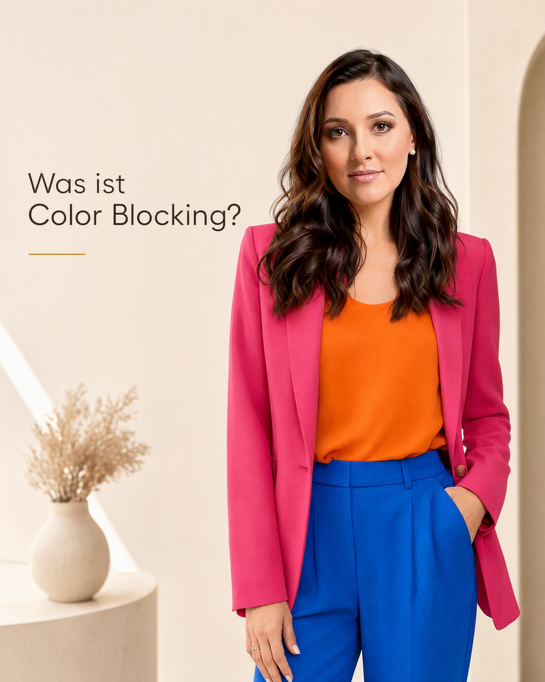
Color Blocking Color blocking is a styling technique that combines two or more large areas of solid color in one outfit. Learn how to use bold color combinations with balance, contrast, and confidence.
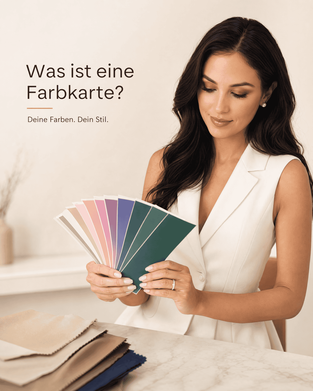
Color Card A Color Card is a curated set of color swatches used in color consultation to help you identify and combine shades that harmonize with your personal coloring.
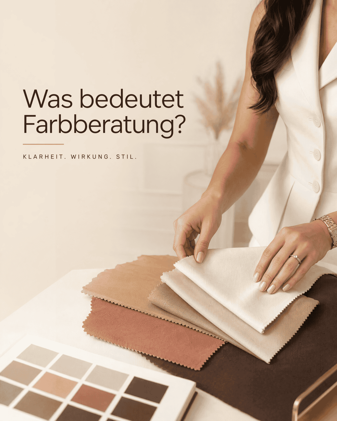
Color Consultation Color consultation identifies the colors, undertones, contrast levels, and brightness that support your natural coloring and desired impact. It helps you choose clothing, accessories, make-up, and wardrobe colors with more clarity.
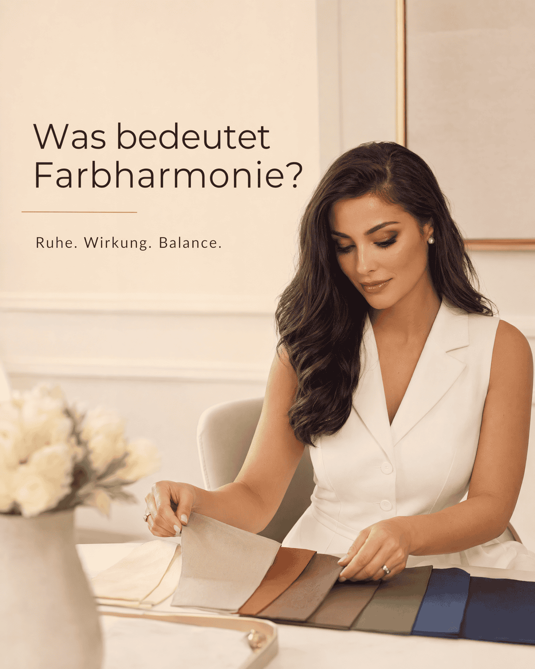
Color Harmony Color harmony describes how colors work together in an outfit and with a person's natural coloring. It helps you choose shades, contrasts, and combinations that feel coherent and support the intended impact.
Color Harmony Index The Color Harmony Index describes how well the primary, secondary, and accent colors in an outfit work together visually.
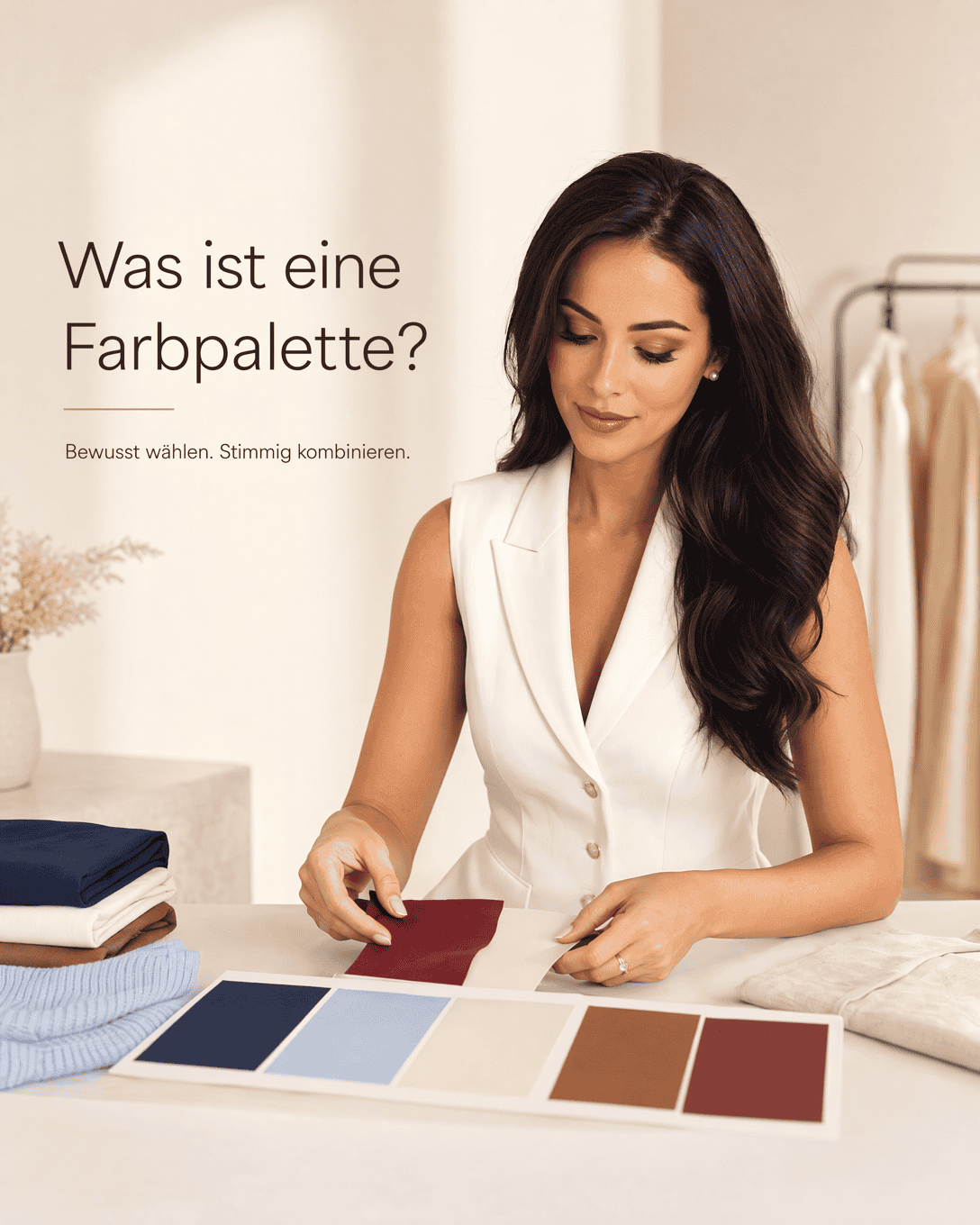
Color Palette A color palette is a selected group of colors that work together in an outfit, wardrobe, brand, or personal color direction. It helps create harmony, manage contrast, and make styling choices easier.
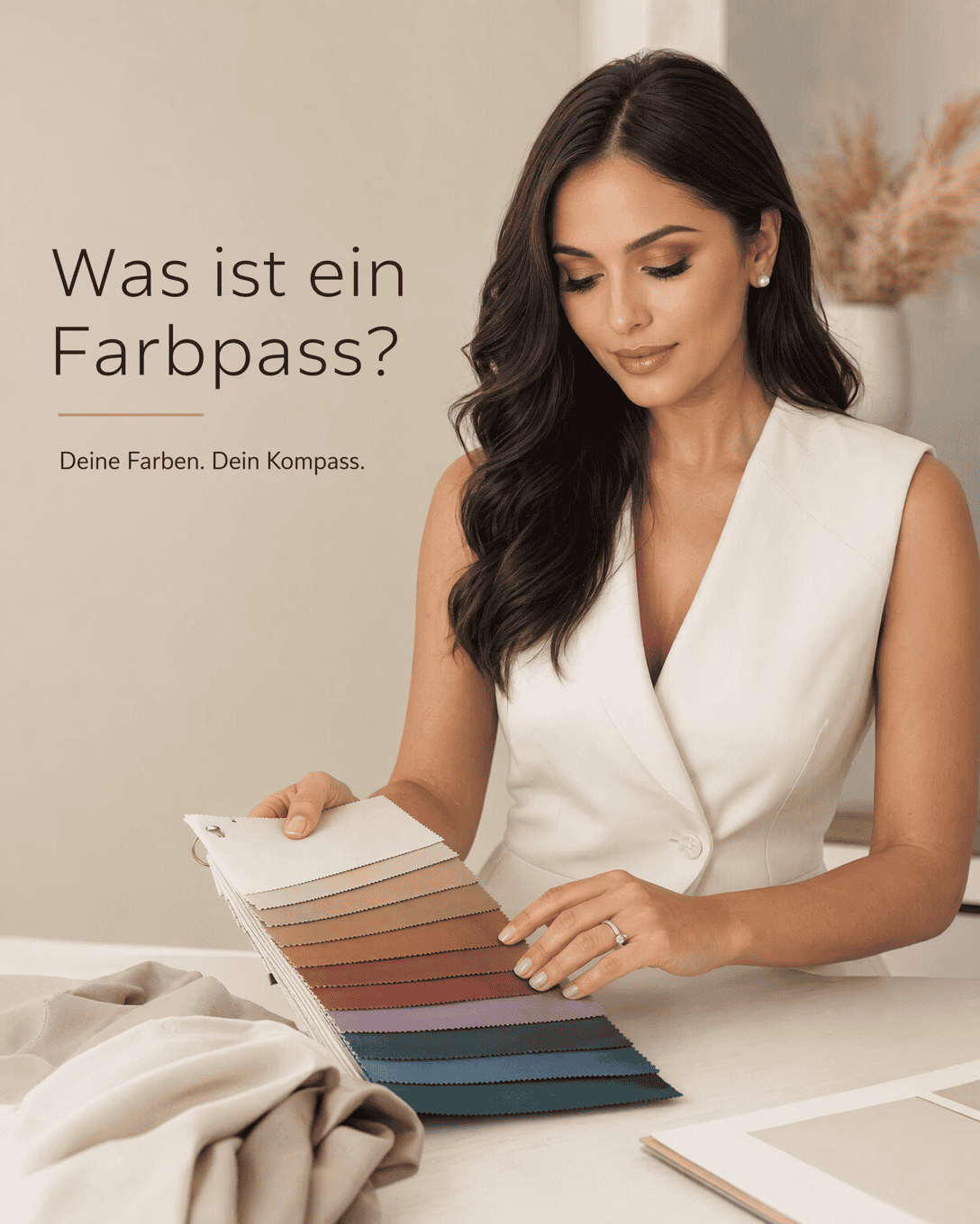
Color Passport A Color Passport is a personalized color reference created through color consultation. It helps you identify flattering shades and combine clothing colors with greater confidence.
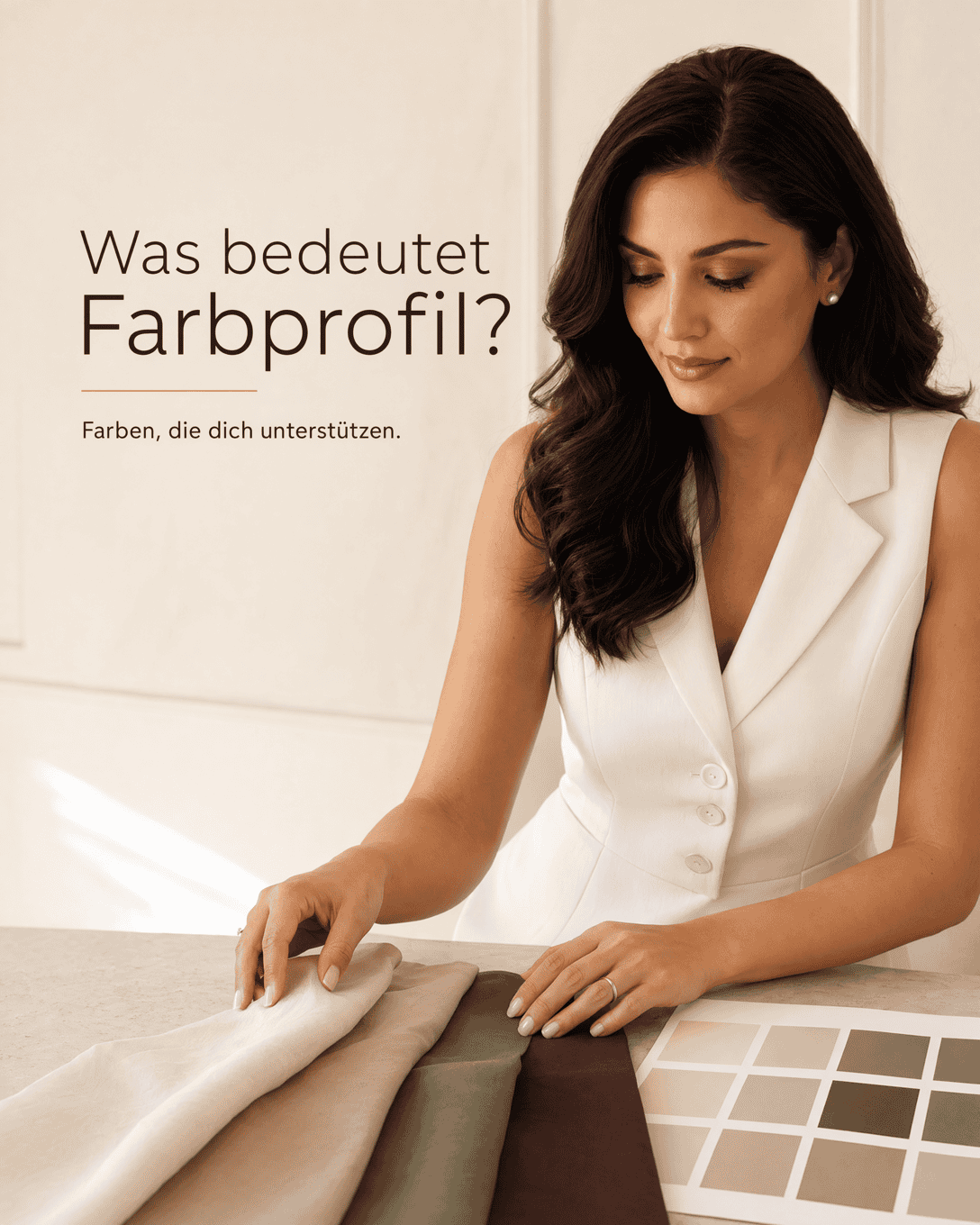
Color Profile A Color Profile brings together your undertone, color depth, clarity, and natural contrast to guide more harmonious personal color choices.
Color Psychology Color Psychology explores how colors can influence perception, mood, and visual communication. In personal style, it helps you choose colors that support the impression you want to create.
Color Saturation Grading Color saturation grading is the process of matching the intensity of clothing colors to the natural clarity and brightness of the skin, eyes, and hair.
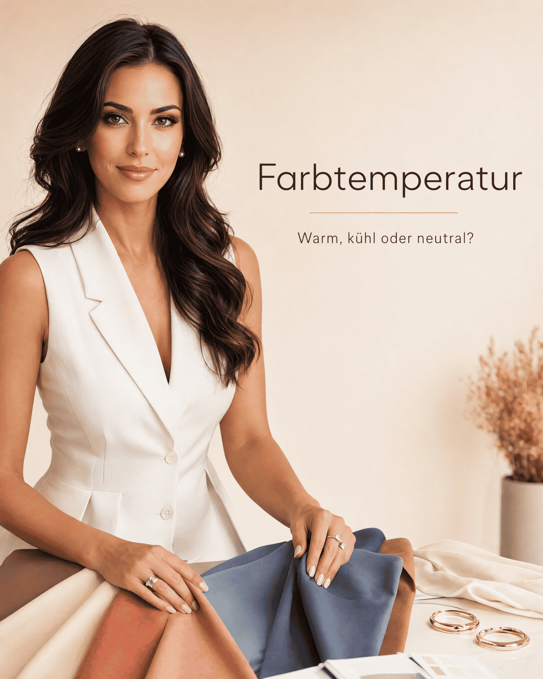
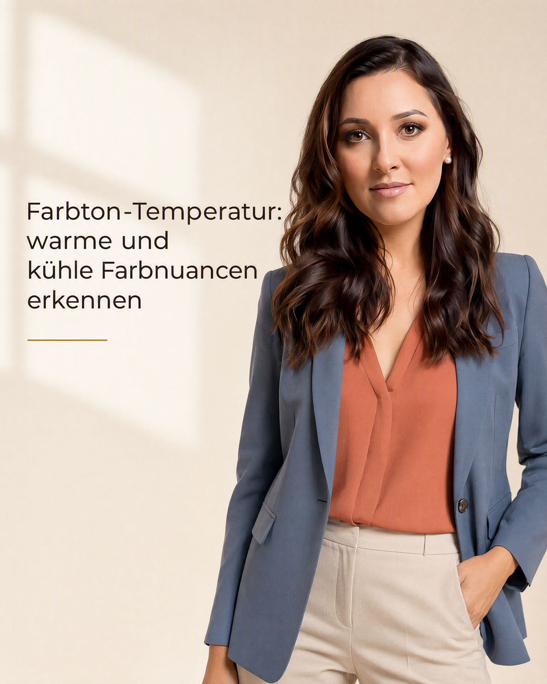
Color Temperature Color Temperature describes whether a color appears warm, cool, or neutral. It helps explain why different versions of the same shade can change the effect of your complexion, outfit, and overall presence.
Color Triad A Color Triad combines three colors spaced evenly around the color wheel. Learn how triadic color schemes create lively, balanced outfits without looking random.
Color Type Color Type describes the combination of temperature, lightness, depth, clarity, and contrast in your natural coloring. It helps identify clothing colors that create a fresh, harmonious, and intentional appearance.
Color Types Color types group the natural visual qualities of skin, hair, and eyes by temperature, lightness, depth, saturation, and contrast. They help you choose clothing colors that create a more harmonious and radiant overall appearance.
Color Typology Color typology is a personal color analysis system that identifies the color qualities that harmonize with your natural coloring, helping you choose more flattering clothing, makeup, and accessories.
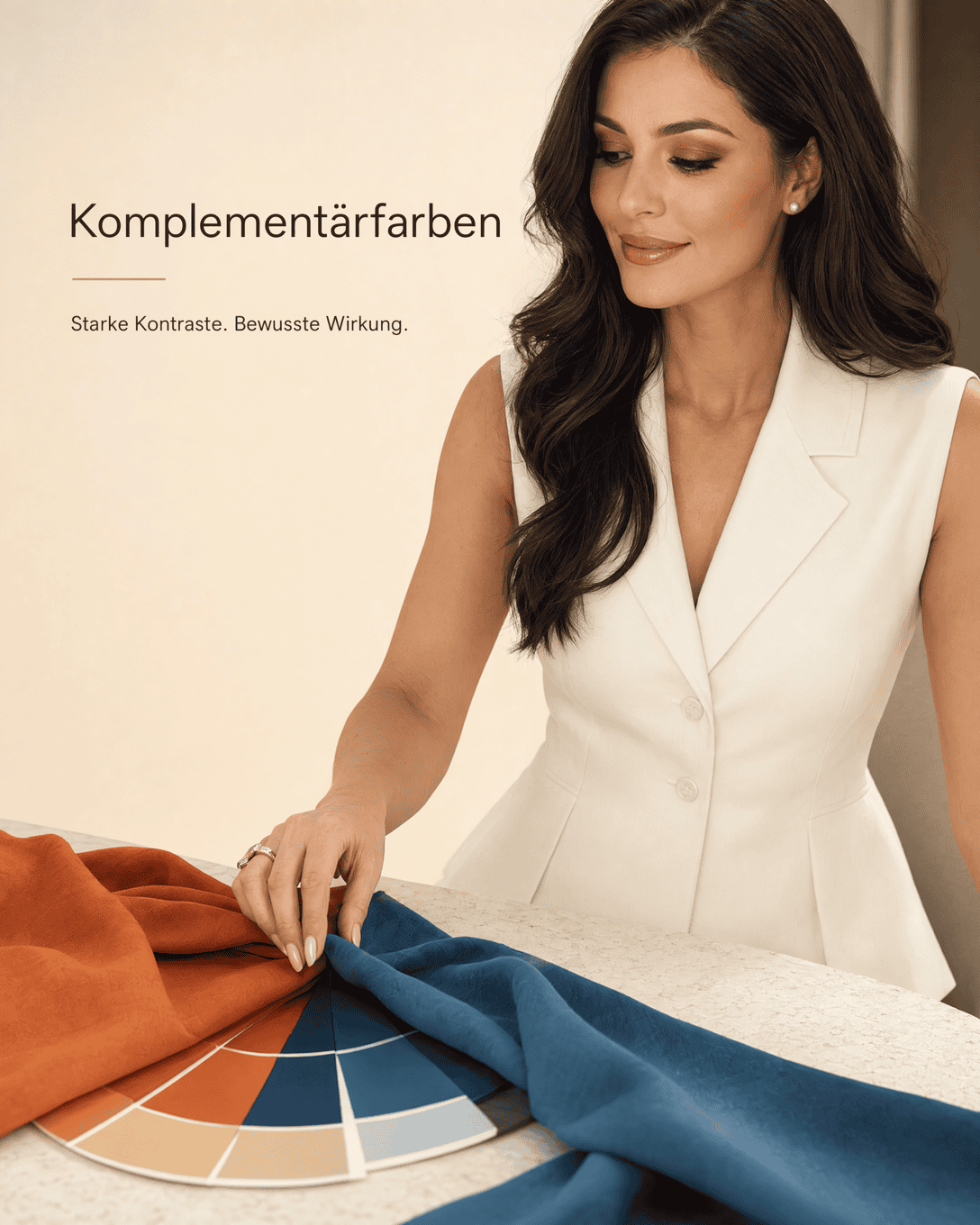
Complementary Colors Complementary colors are colors positioned opposite each other on the color wheel. They create strong contrast and can make outfits feel vivid, balanced, or intentionally dramatic.
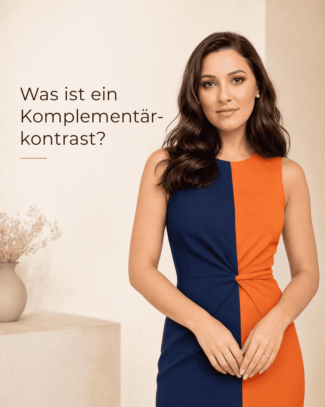
Complementary Contrast Complementary contrast pairs colors opposite each other on the color wheel. Learn how to use this high-impact color contrast in outfits with balance and intention.
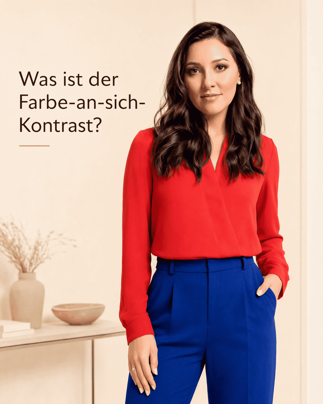
Contrast Contrast is the visible difference between colors, lightness levels, patterns, and textures. In personal style, it helps determine whether an outfit appears soft, calm, bold, or highly defined near the face.
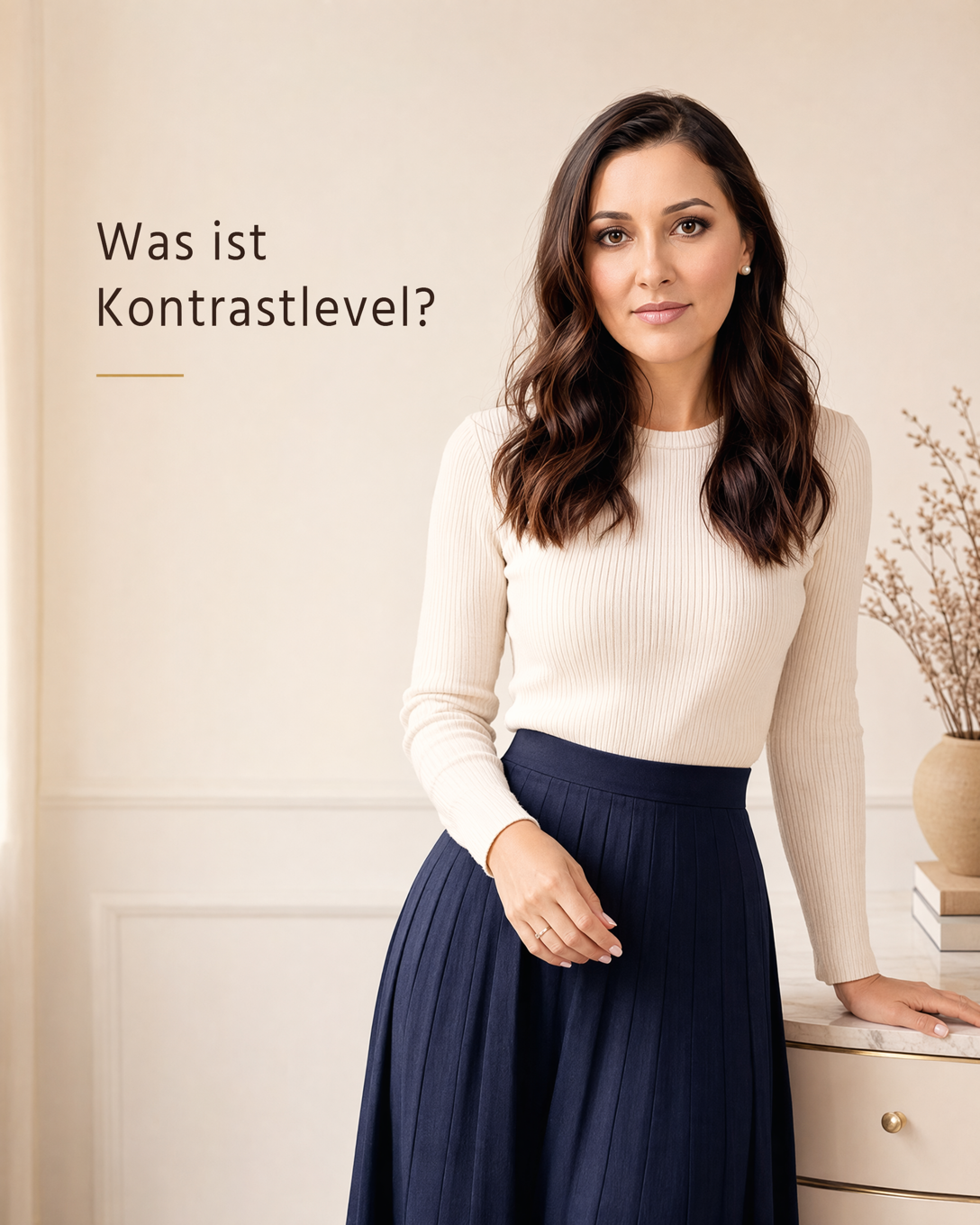
Contrast Level Contrast level describes the visible difference between your hair, skin, and eye coloring. It helps you choose clothing color combinations, patterns, and details with a level of visual contrast that feels balanced.
Contrast Typology Contrast typology identifies the natural light-dark difference in your facial features to guide flattering color combinations, patterns, and outfit contrast.
Cool Summer Color Type Cool Summer is a cool, softly muted color type in the 12 season color analysis system. It is often suited to calm, blue-leaning, medium-light shades rather than warm or highly vivid colors.
Cool Winter Cool Winter is a distinctly cool, clear, high-contrast color type in seasonal color analysis. It is usually supported by icy, blue-based, and richly saturated shades.
Cream White Cream White is a soft off-white shade with a warm, creamy undertone. Learn how to recognize it, combine it, and assess whether it suits your personal color direction.
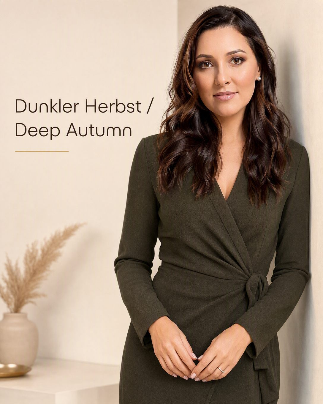
Deep Autumn Color Type Deep Autumn, also called Dark Autumn, is a warm, deep color direction in seasonal color analysis. It is associated with rich, earthy, and dark shades that create a harmonious, grounded effect.
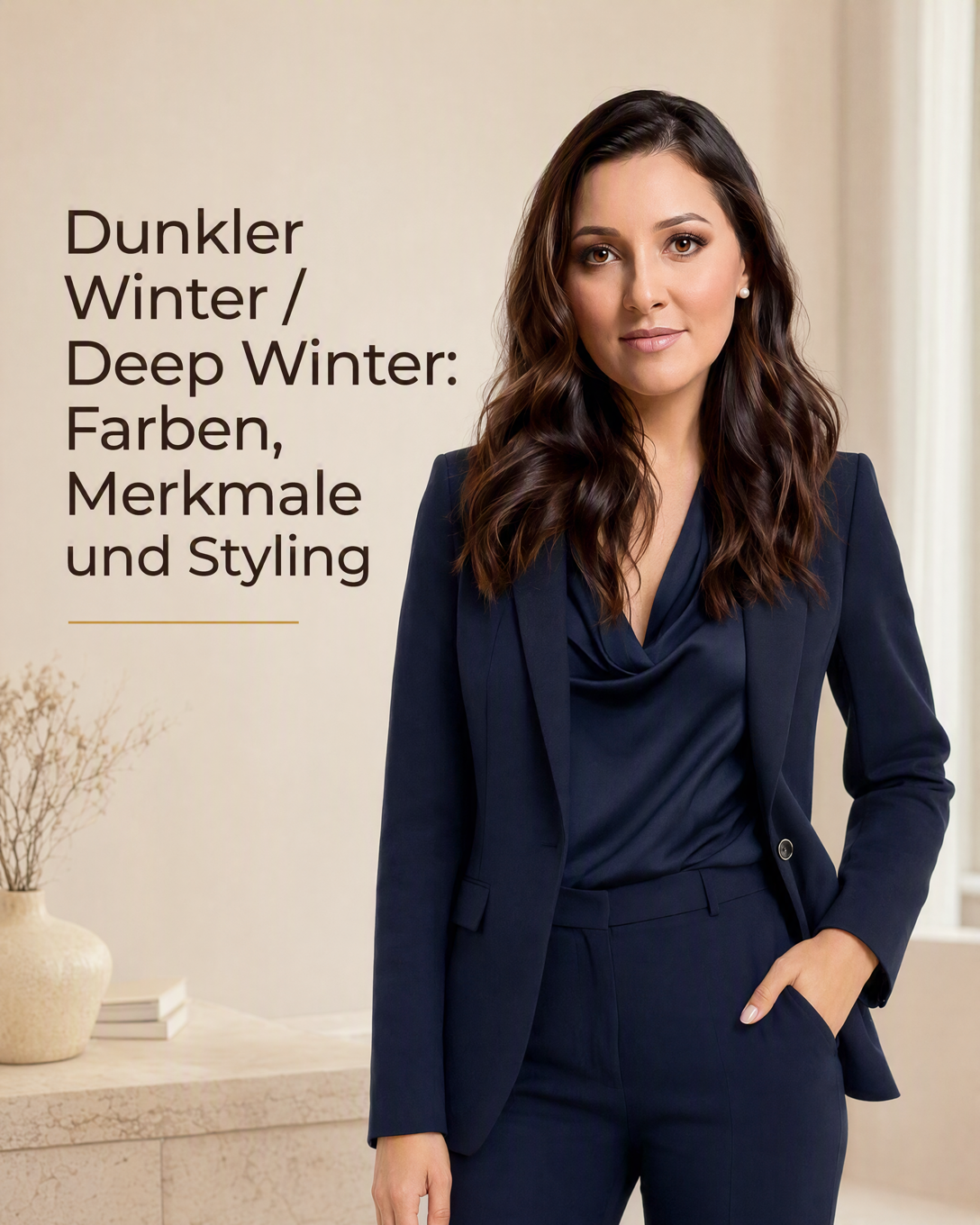
Deep Winter Color Type Deep Winter, also called Dark Winter, is a cool to neutral-cool color type defined by depth, clarity, and strong contrast. Dark, clear, and intense colors often create its most harmonious effect.
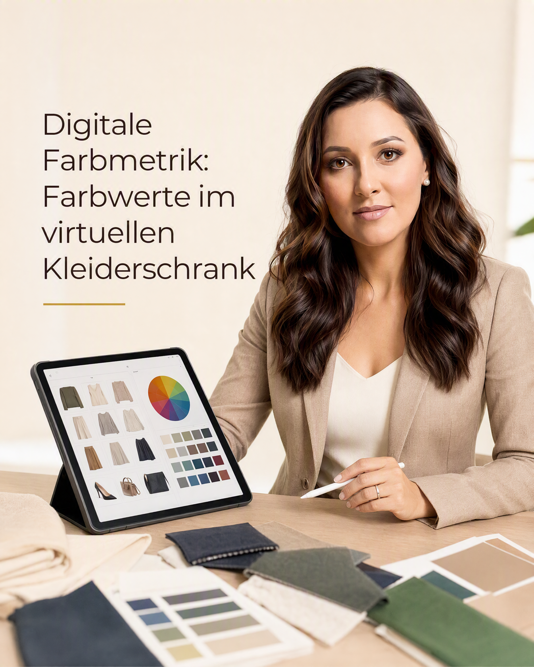
Digital Color Metrics Digital Color Metrics uses recorded color values to compare clothing shades and create more coordinated outfit suggestions in a virtual wardrobe.
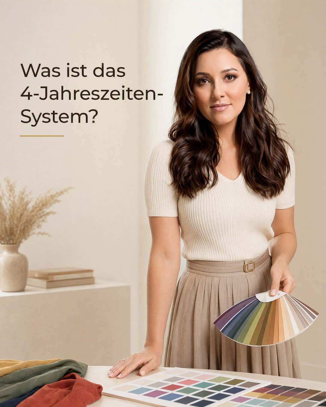
Four Season Color Analysis Four Season Color Analysis is a personal color system that groups coloring into Spring, Summer, Autumn, and Winter using warmth, coolness, lightness, depth, and clarity.
Hue Contrast Hue Contrast describes the visual contrast between different colors. Learn how to use hue contrast in outfits, color combinations, and personal styling.
Hue Temperature Hue temperature describes whether a clothing color appears warm, cool, or balanced between the two. It helps you compare subtle color nuances and create more harmonious outfits.
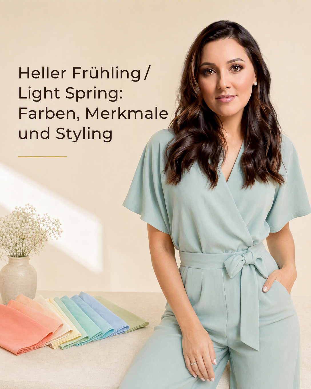
Light Spring Color Type Light Spring is a warm to neutral-warm, light color type within seasonal color analysis. It is flattered by fresh, luminous, and relatively clear colors with a gentle overall contrast.
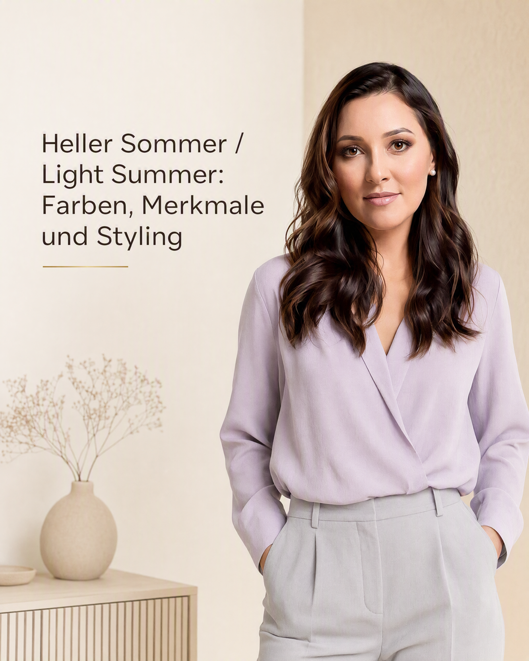
Light Summer Light Summer is a cool to neutral-cool, light color type in seasonal color analysis. It is typically flattered by delicate, airy, softly muted colors rather than dark, warm, or highly saturated shades.
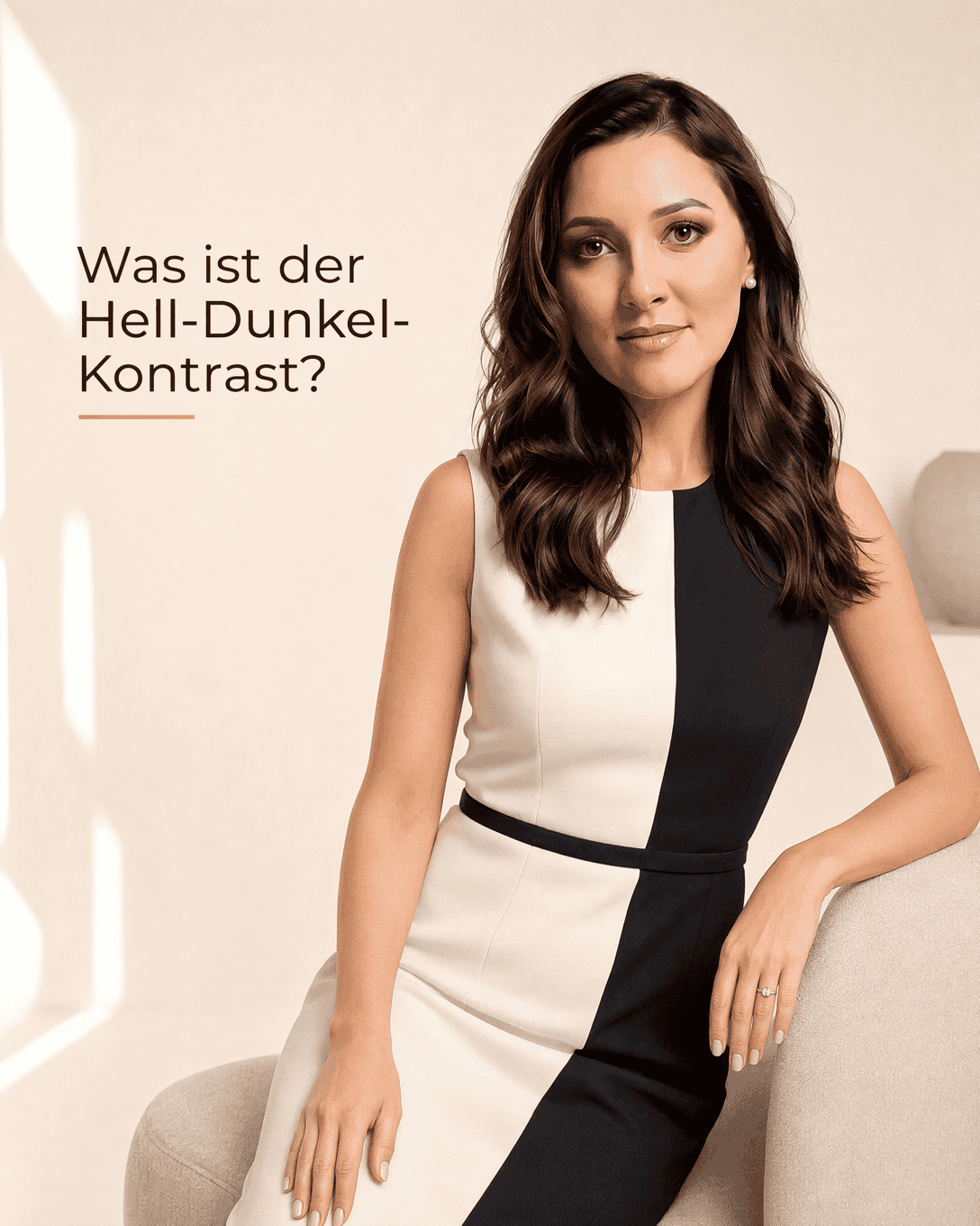
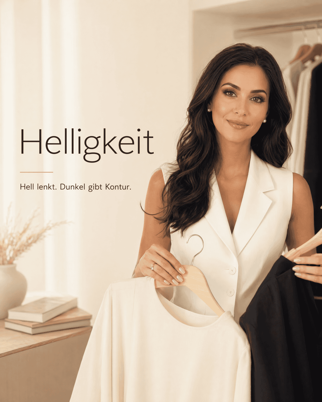
Light-Dark Contrast Light-Dark Contrast describes the visible difference between light and dark colors. Learn how to use it in outfits, personal color analysis, and wardrobe planning.
Lightness Lightness describes how light or dark a color appears. In color consultation, it helps you choose shades that create harmonious contrast with your natural coloring.
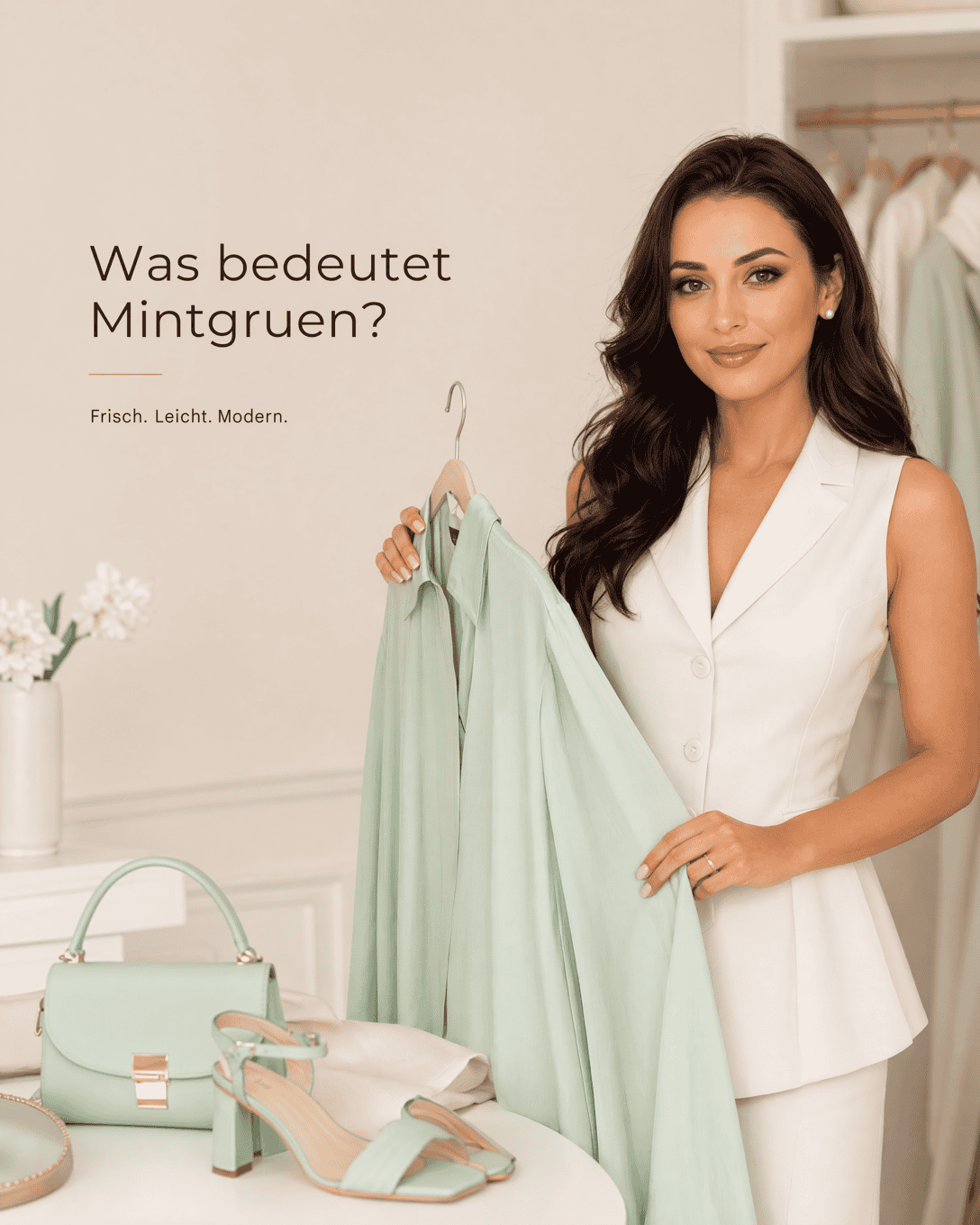
Mint Green Mint Green is a light, fresh green with a cool to neutral character. Learn what mint green means, how it affects an outfit, and which colors combine well with it.
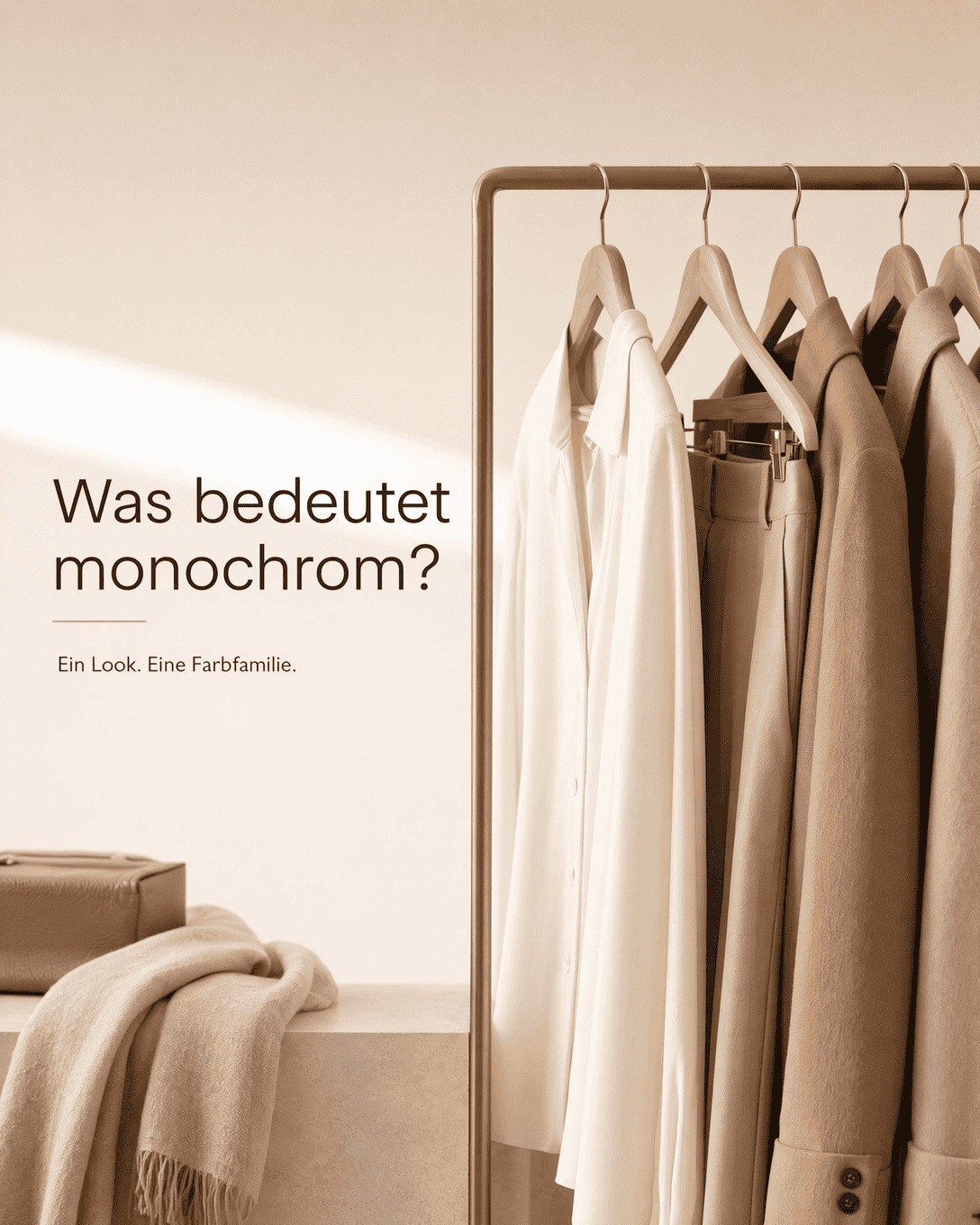
Monochrome Styling Monochrome fashion uses one color, or closely related shades of one color, throughout an outfit. Learn how to create a harmonious monochromatic look with the right tone, texture, and contrast.
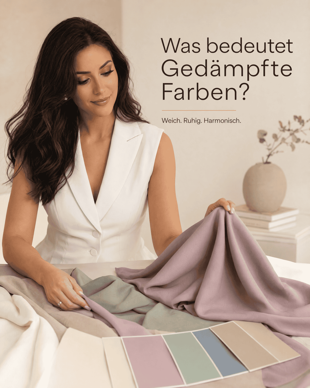
Muted Colors Muted colors are softened, low-saturation shades with a calm, understated effect. Learn how to recognize muted colors and use them in color analysis, outfits, and personal styling.
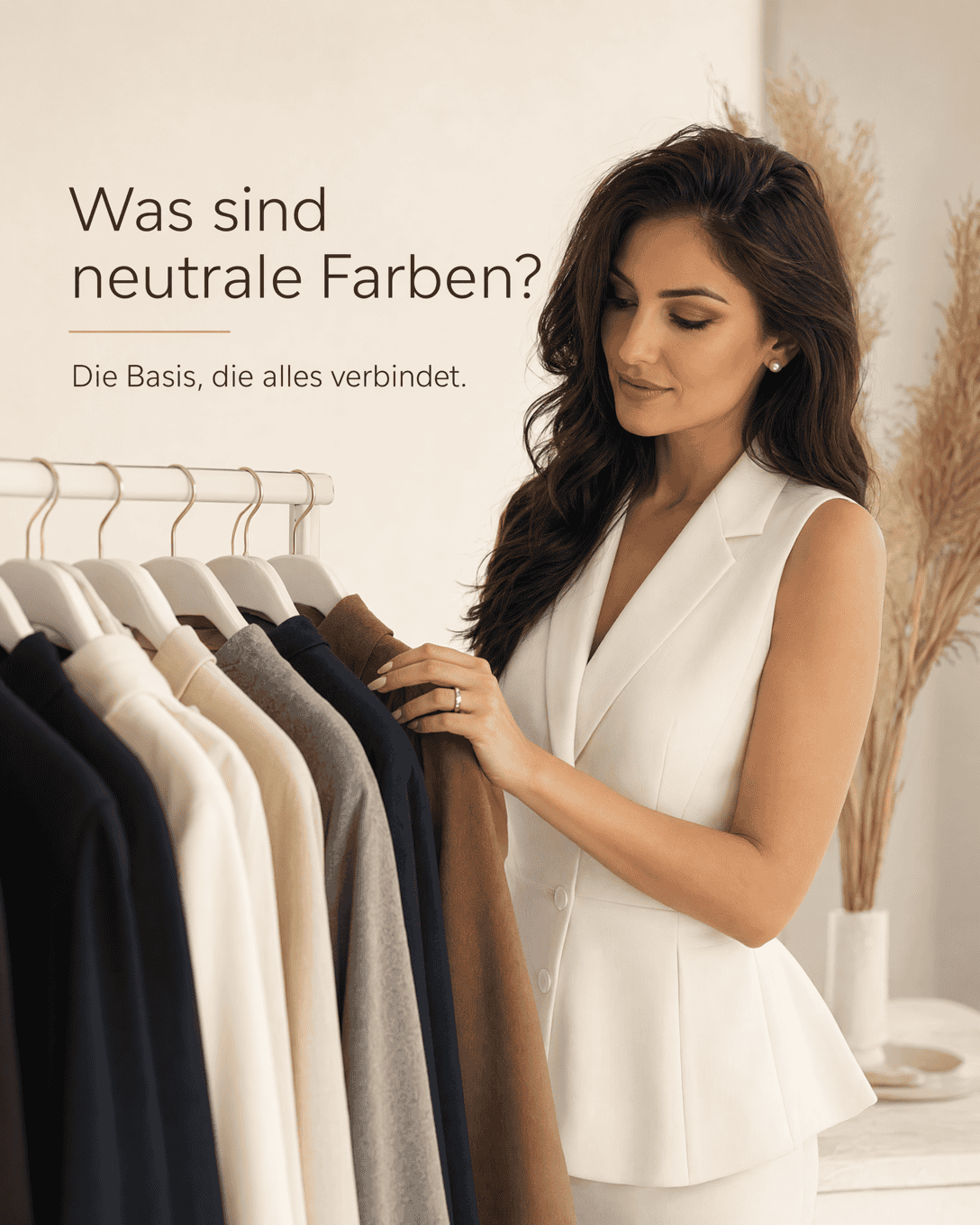
Neutral Colors Neutral colors are versatile, low-key shades that form the foundation of many wardrobes. Learn which colors count as neutrals, how undertones affect them, and how to choose neutral colors that harmonize with you.
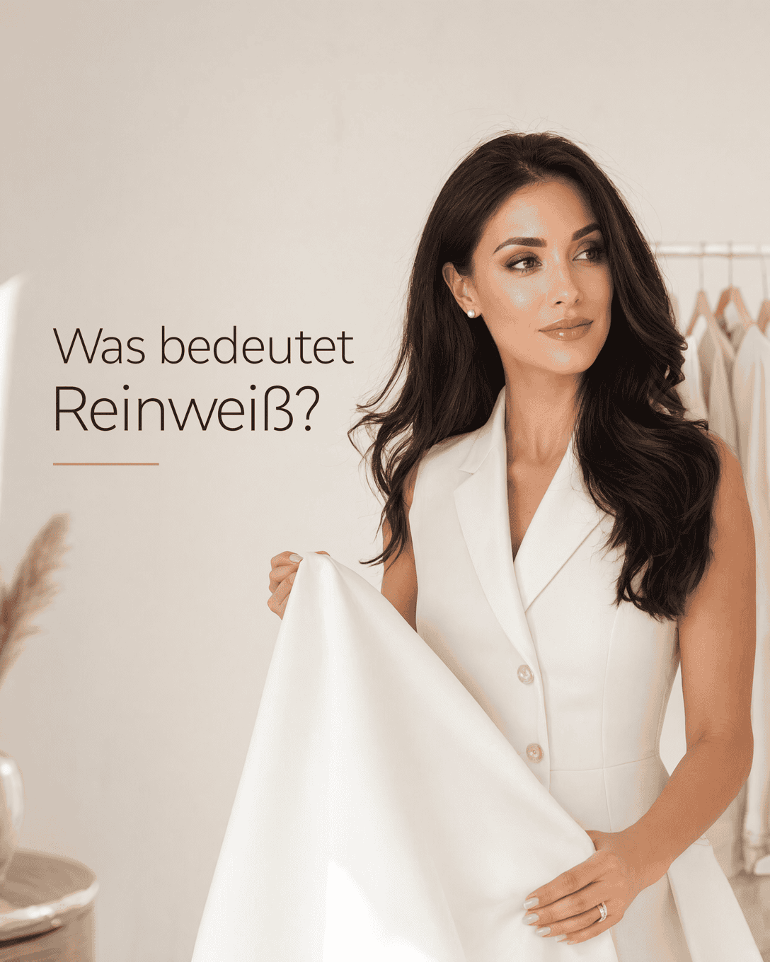
Pure White Pure White is a bright, clear white with little visible yellow, gray, or cream cast. Learn how pure white affects undertone, contrast, and outfit harmony.
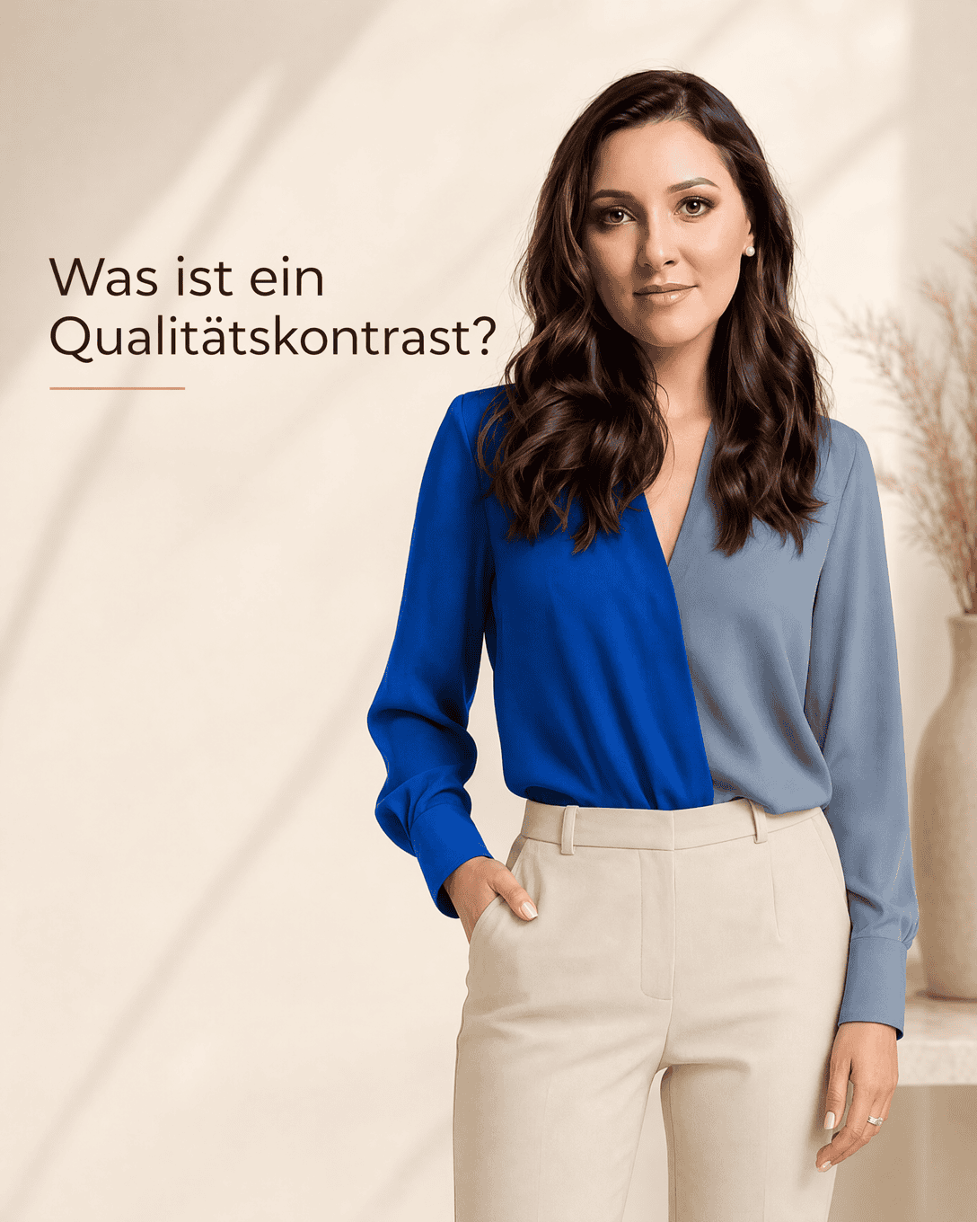
Quality Contrast Quality Contrast describes the difference between clear, saturated colors and softened, muted colors. Learn how to use this color contrast to create focused, balanced outfits.
Quantity Contrast Quantity Contrast describes how the relative area of each color changes the balance, intensity, and visual impact of an outfit.
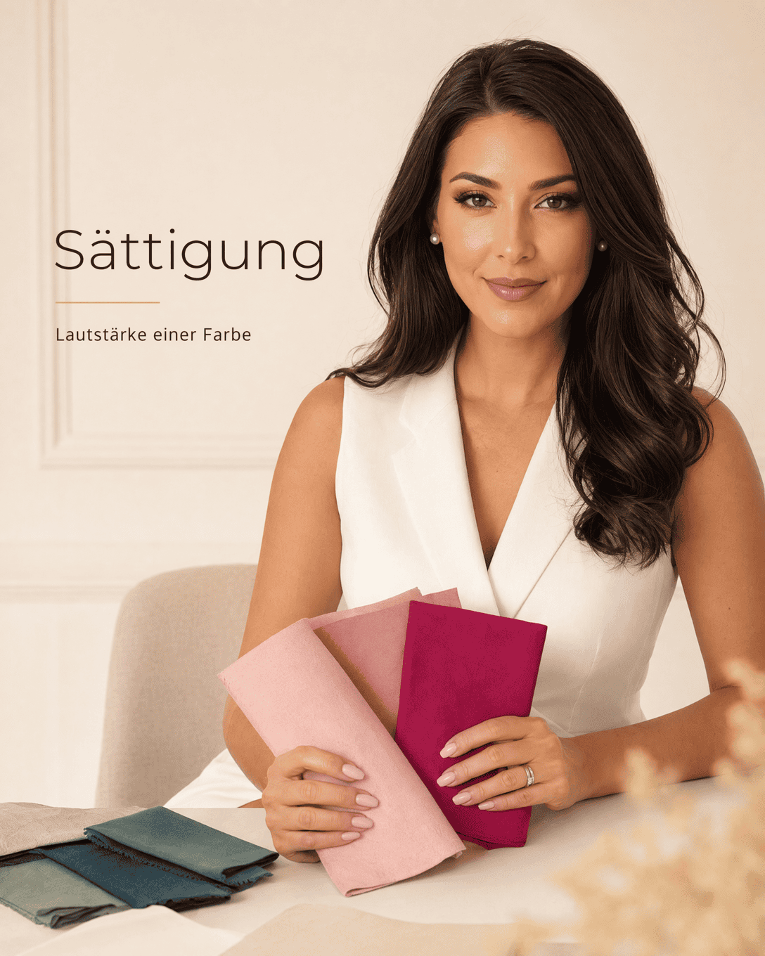
Saturation Saturation describes how vivid, pure, or muted a color appears. In color consultation, it helps you choose colors that create harmony with your natural coloring and desired style impact.
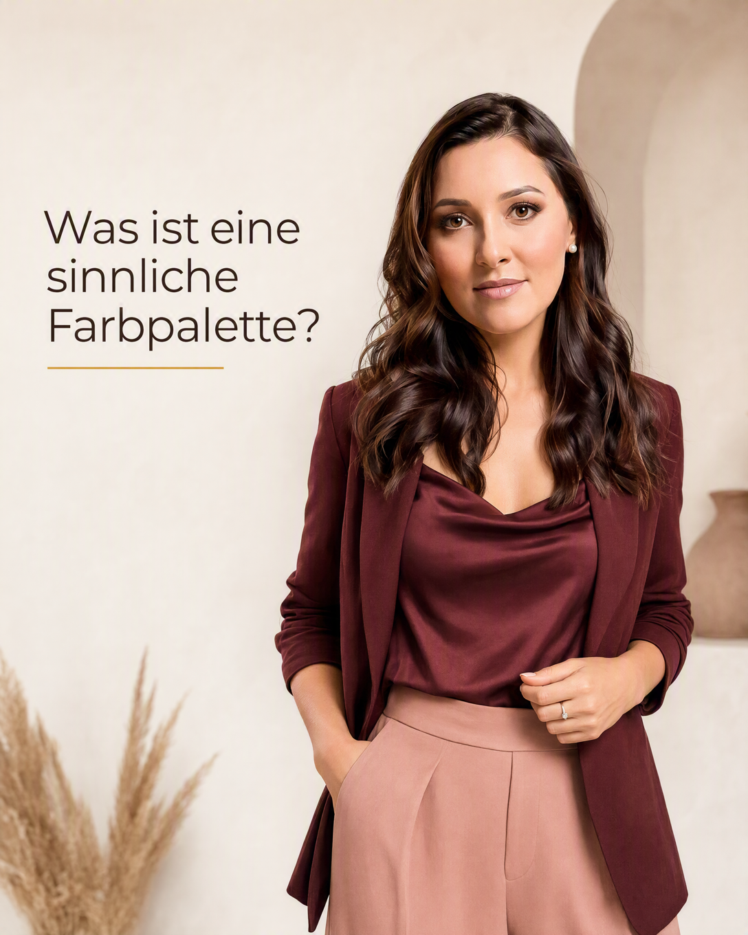
Sensual Color Palette A sensual color palette uses deep, soft, or skin-inspired shades to create a romantic, intimate, and polished outfit mood.
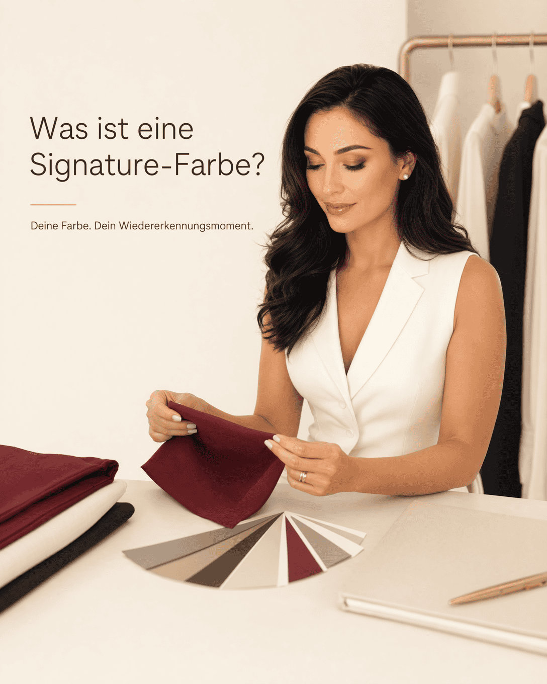
Signature Color A Signature Color is a shade or color family that becomes recognizably associated with a person, their style, or their public image. Learn how to choose and wear a signature color that suits your coloring, wardrobe, and desired impact.
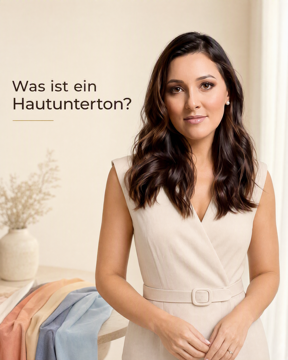
Skin Undertone Skin undertone is the subtle warm, cool, neutral, or olive cast beneath the surface of the skin. It helps explain why certain clothing colors, makeup shades, and metals look more harmonious than others.
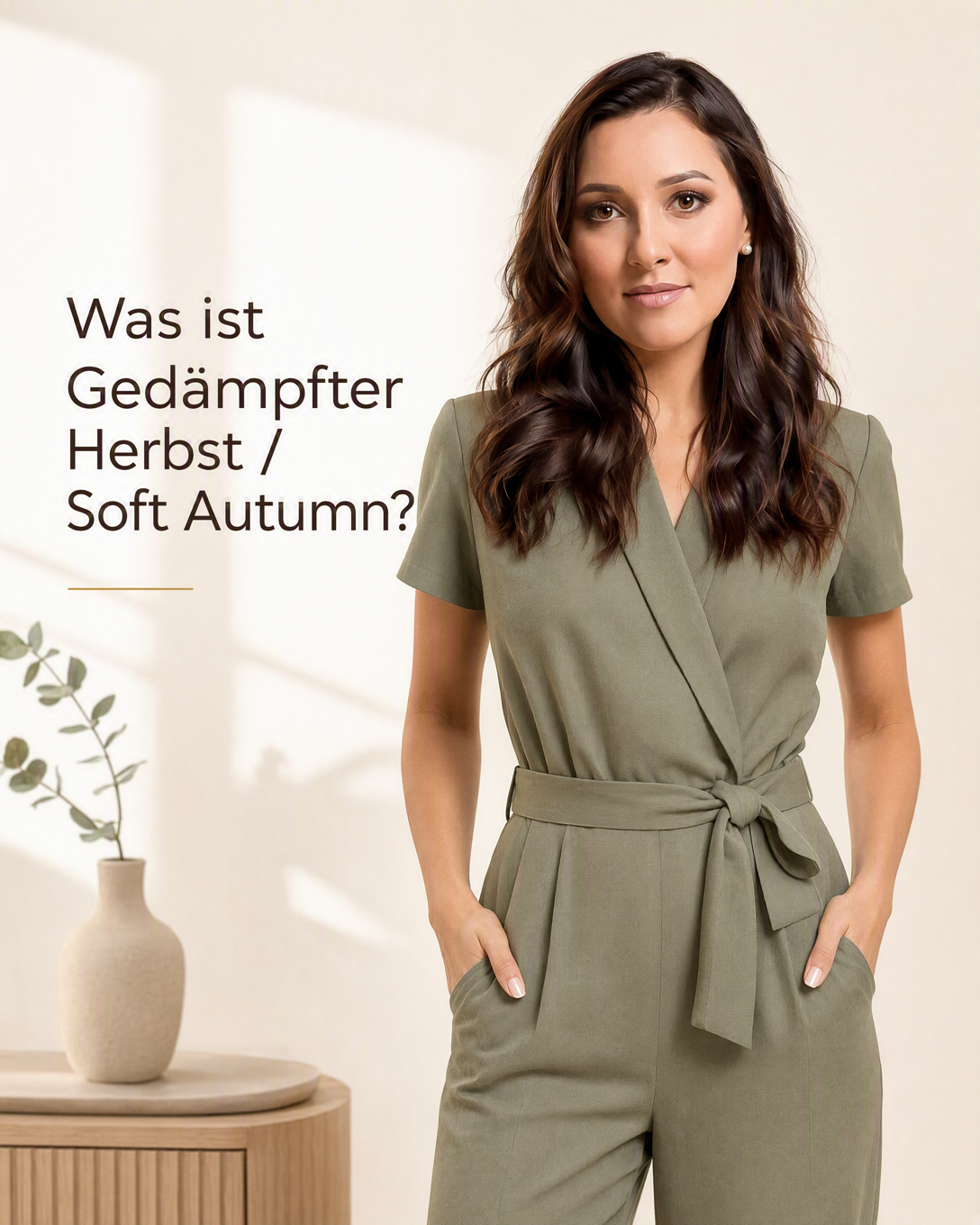
Soft Autumn Soft Autumn is a neutral to warm, muted color type with gentle contrast. It is usually associated with softened earthy shades that create a calm, harmonious effect.
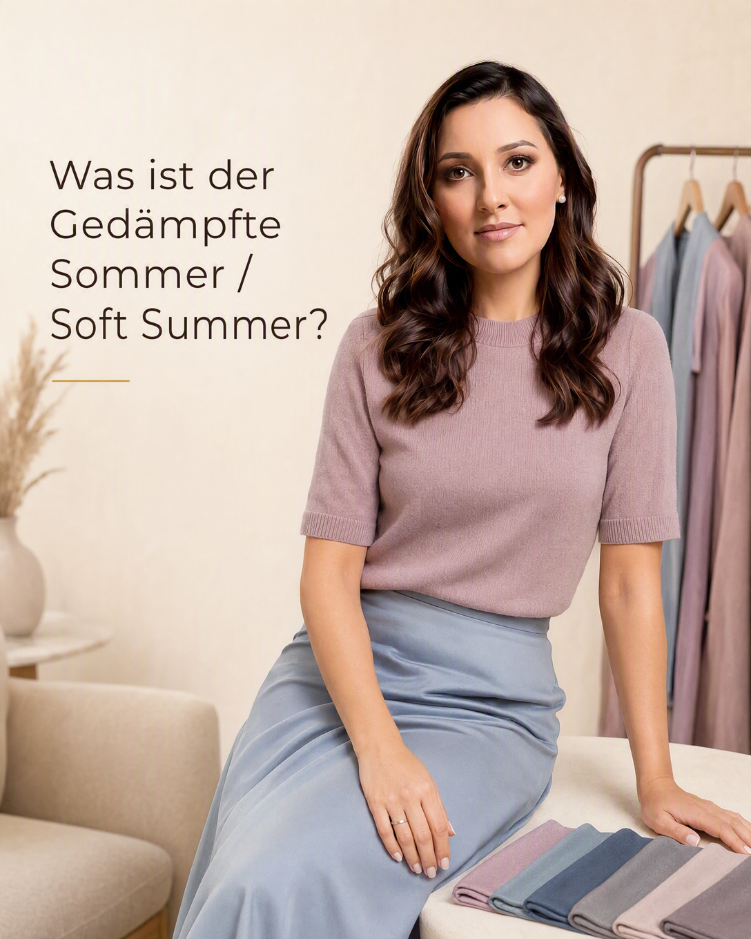
Soft Summer Soft Summer is a neutral-cool, muted color type with low to medium contrast. It is typically flattered by soft, gray-based shades rather than bright, warm, or sharply contrasting colors.
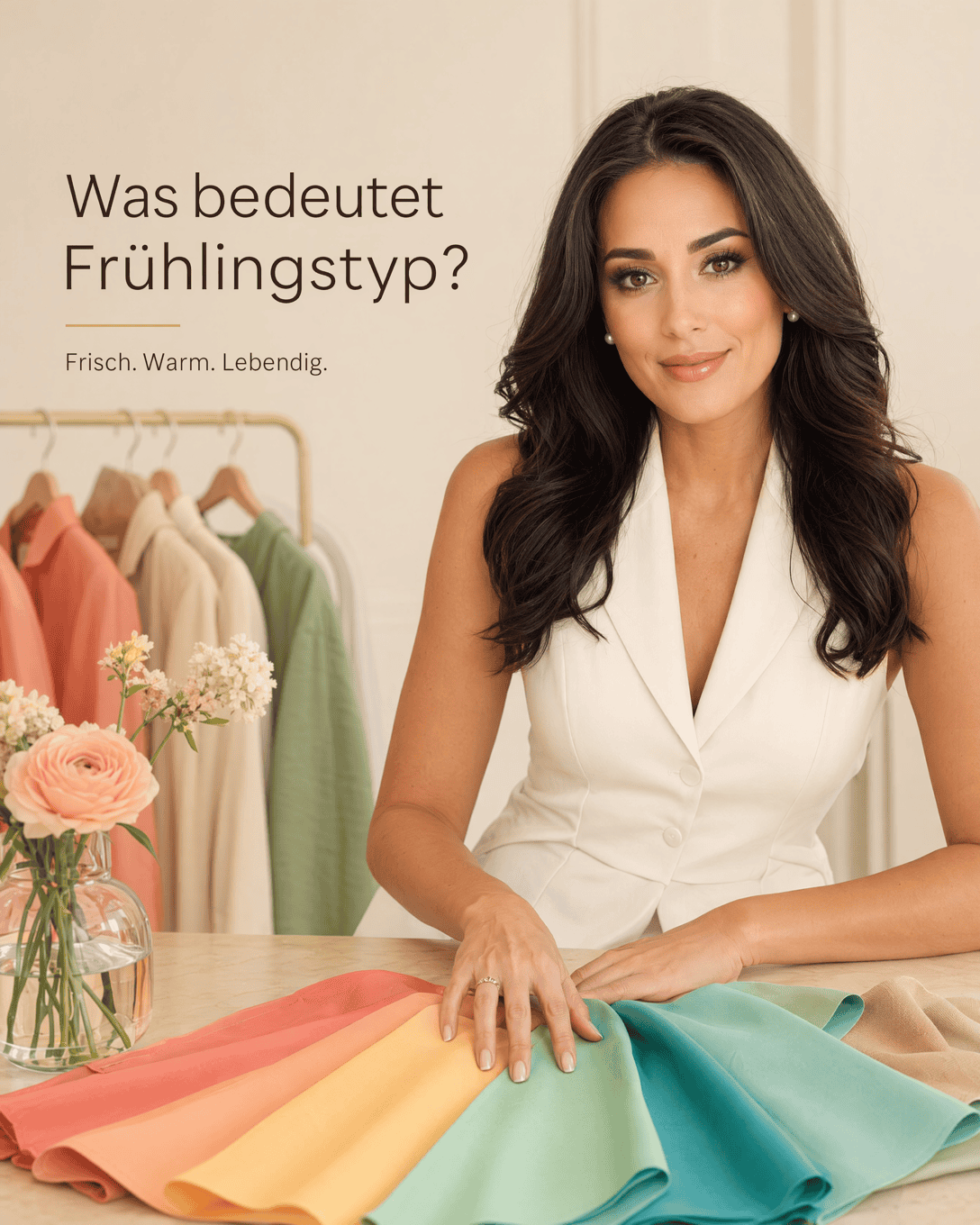
Spring Color Type Spring Color Type describes a warm, light, and clear color direction in seasonal color analysis. It helps identify fresh, luminous shades that can create harmony with a person's natural coloring.
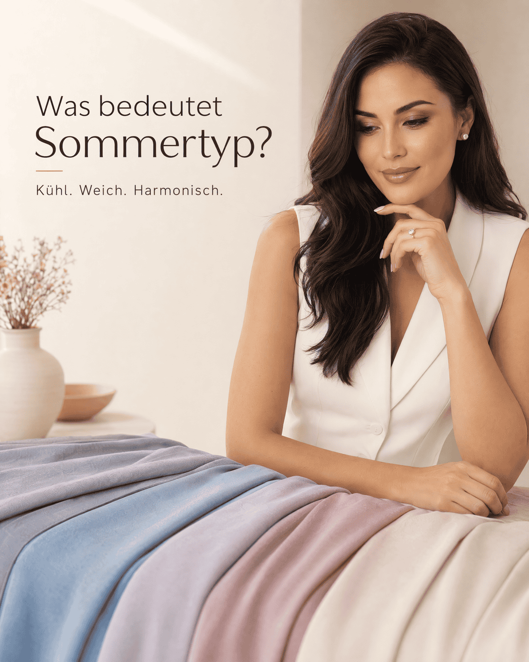
Summer Color Type Summer Color Type describes a cool, muted, and often low to medium contrast color direction in seasonal color analysis. Learn which Summer colors tend to create a harmonious, calm effect and how to use them in outfits.
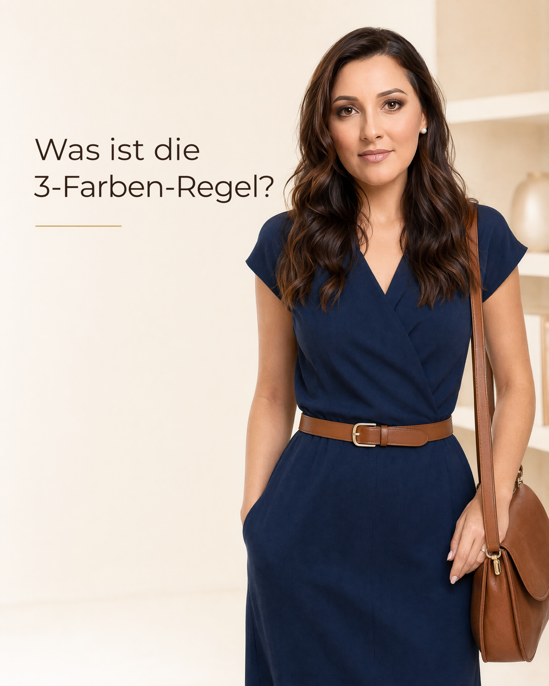
Three-Color Rule The Three-Color Rule is a simple outfit styling guideline that limits a look to three main colors for a clear, balanced result.
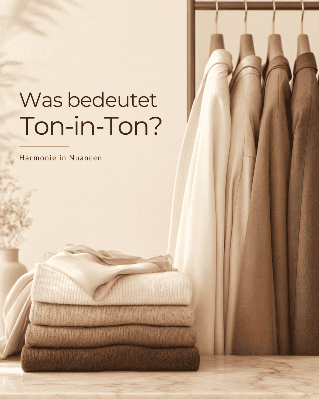
Tone-on-Tone Tone-on-Tone styling combines closely related shades from one color family to create a harmonious, polished outfit with controlled contrast.
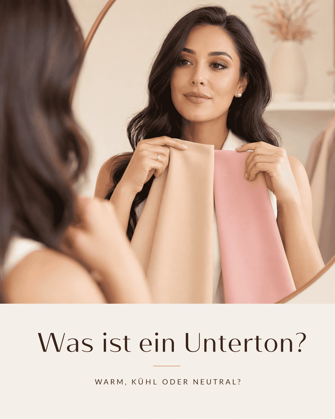
Undertone Undertone is the underlying warm, cool, neutral, or olive cast of the complexion. It helps explain why certain clothing colors, metals, and makeup shades make the face look clearer and more balanced than others.
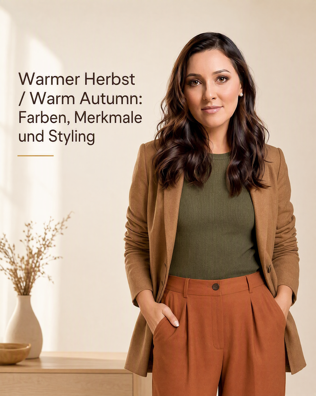
Warm Autumn Color Type Warm Autumn is a distinctly warm color type in seasonal color analysis. It is often supported by golden, earthy, rich, and naturally softened shades.
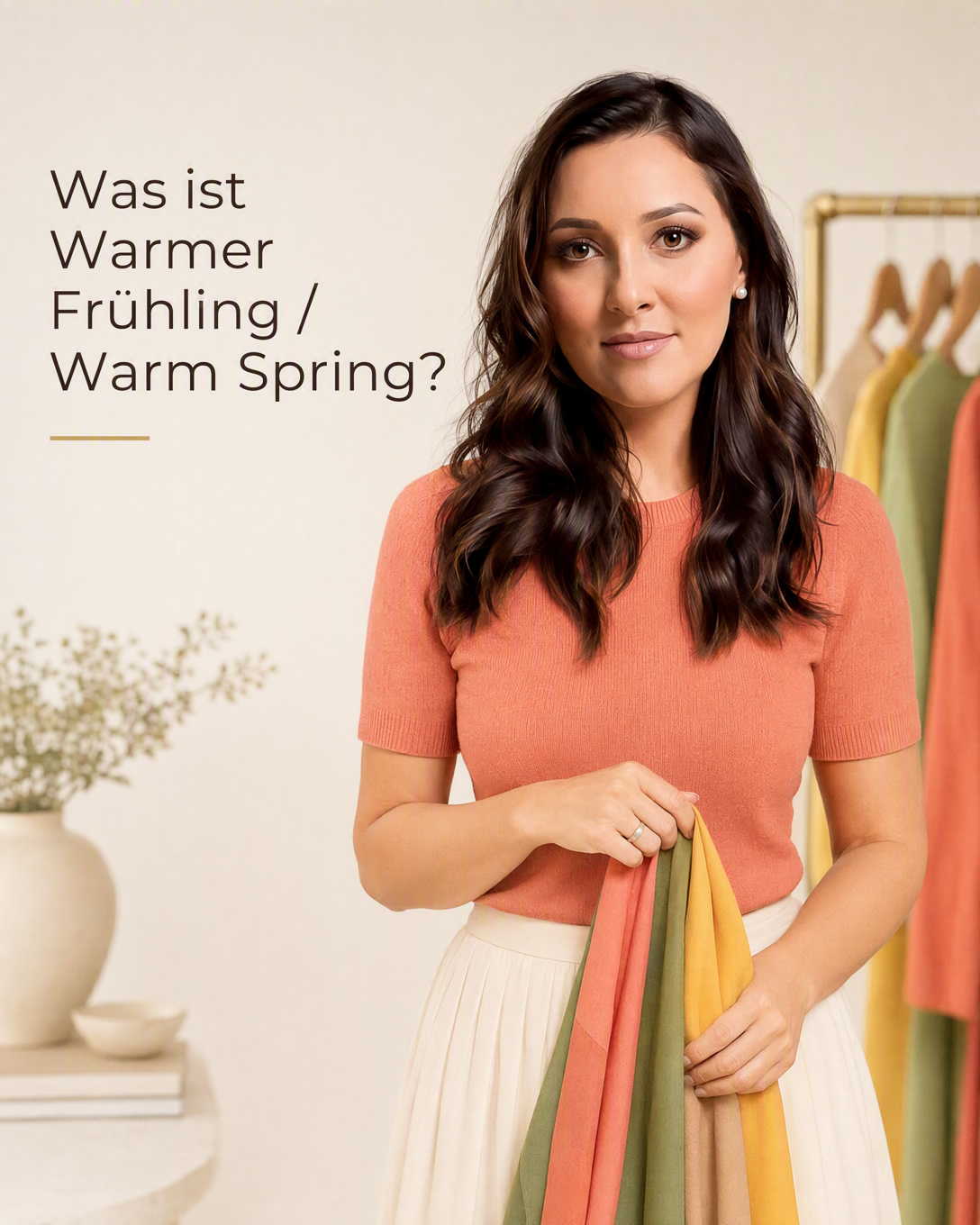
Warm Spring Color Type Warm Spring is a personal color type defined by a distinctly warm, fresh, and lively color direction. Golden, sunny, and clear shades tend to create its most harmonious effect.
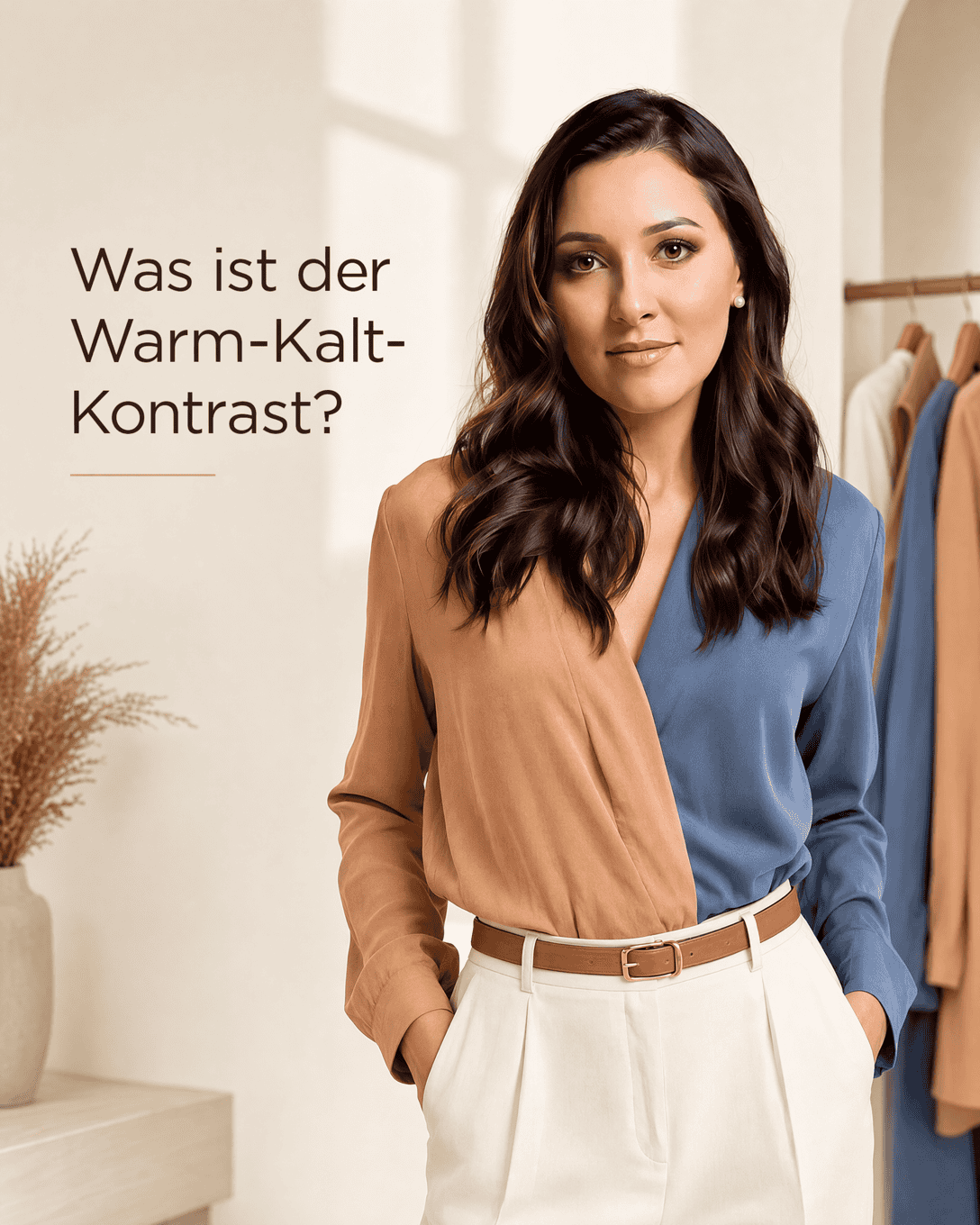
Warm-Cool Contrast Warm-Cool Contrast describes the visible tension between warm and cool colors. Learn how to use it in outfits, color analysis, and wardrobe planning.
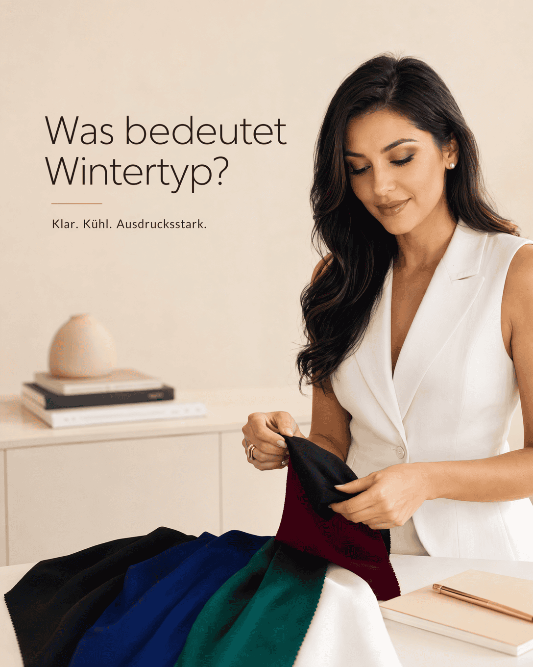
Winter Color Type Winter Color Type is a personal color-analysis category associated with cool, clear, and often high-contrast coloring. It helps identify colors that can create a clear, harmonious effect near the face.