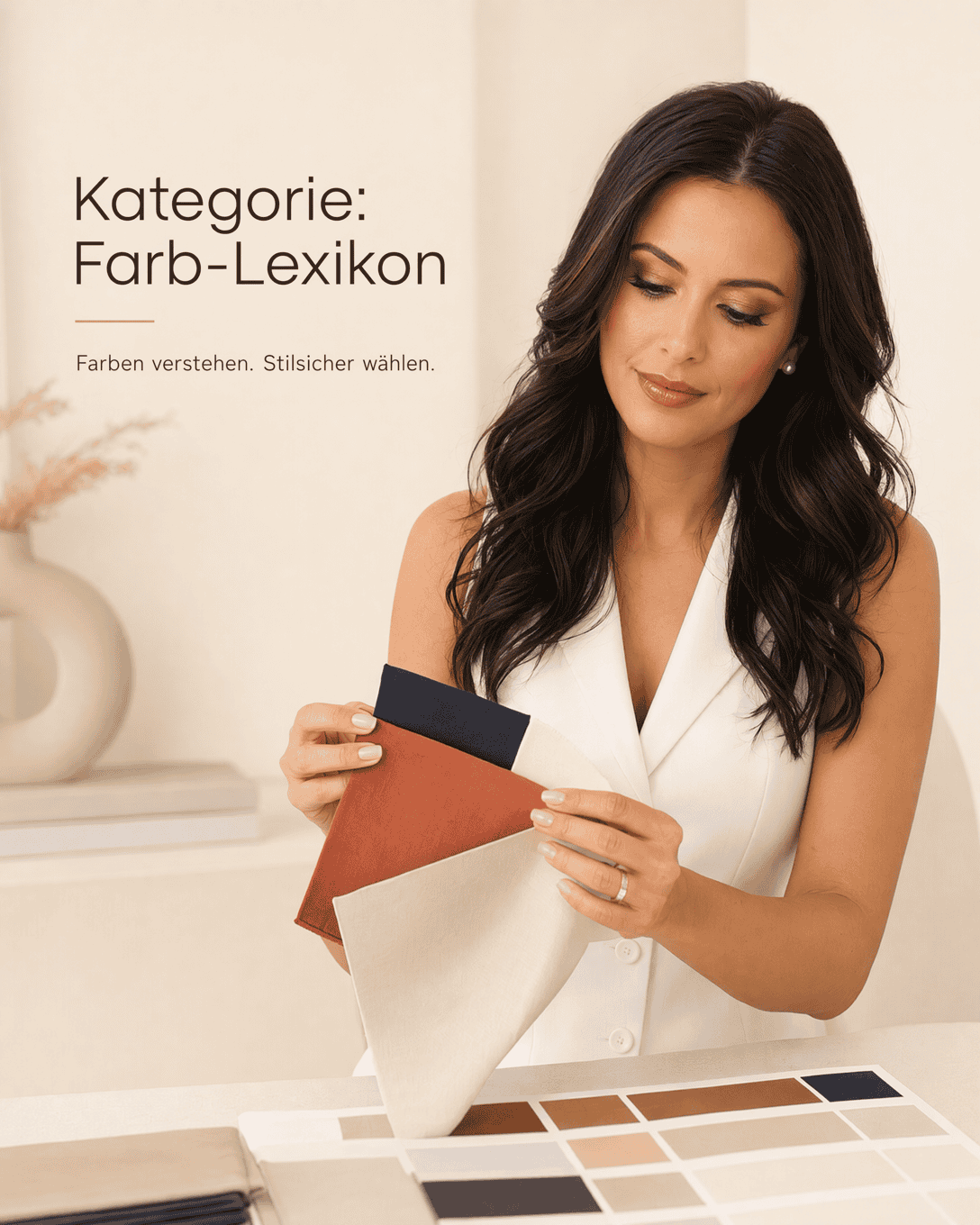
Category: Color Lexicon
Explore fashion color names and shade descriptions, from navy and camel to terracotta, cream, and petrol. Learn how to recognize color nuances and combine them with more confidence.
What this color lexicon covers
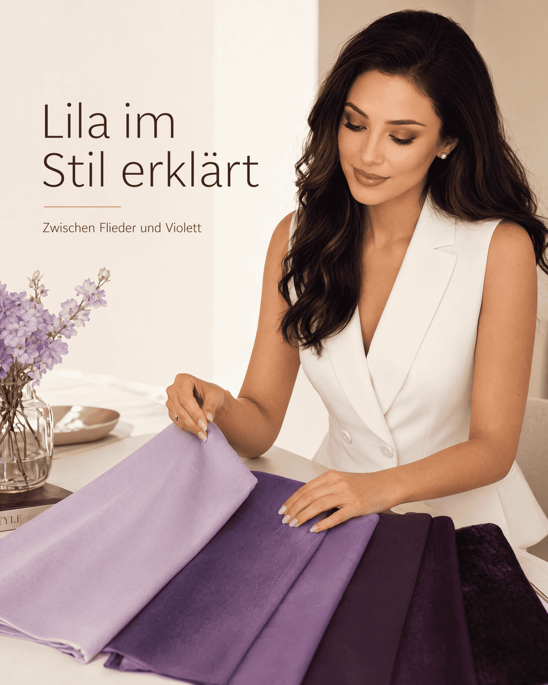
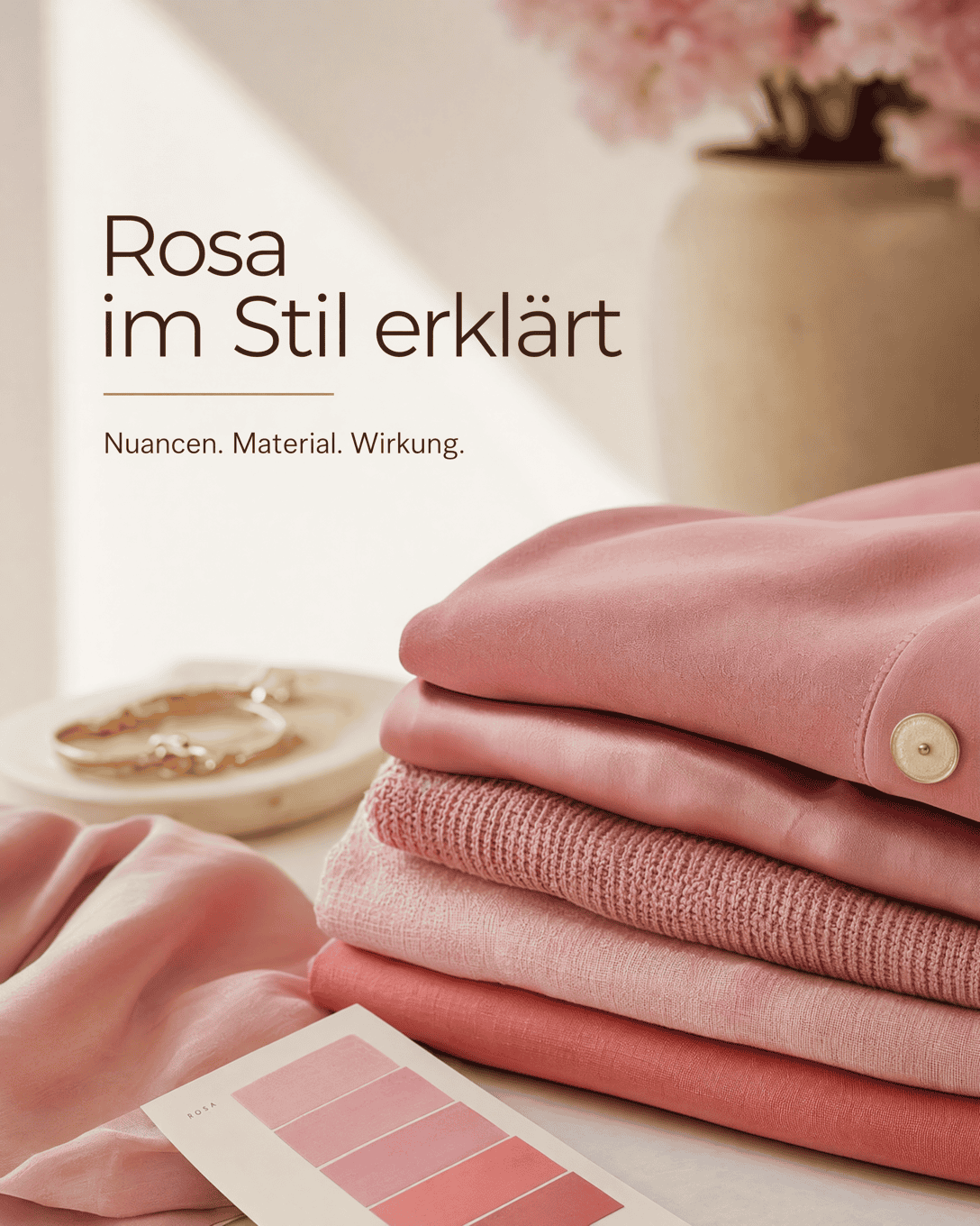
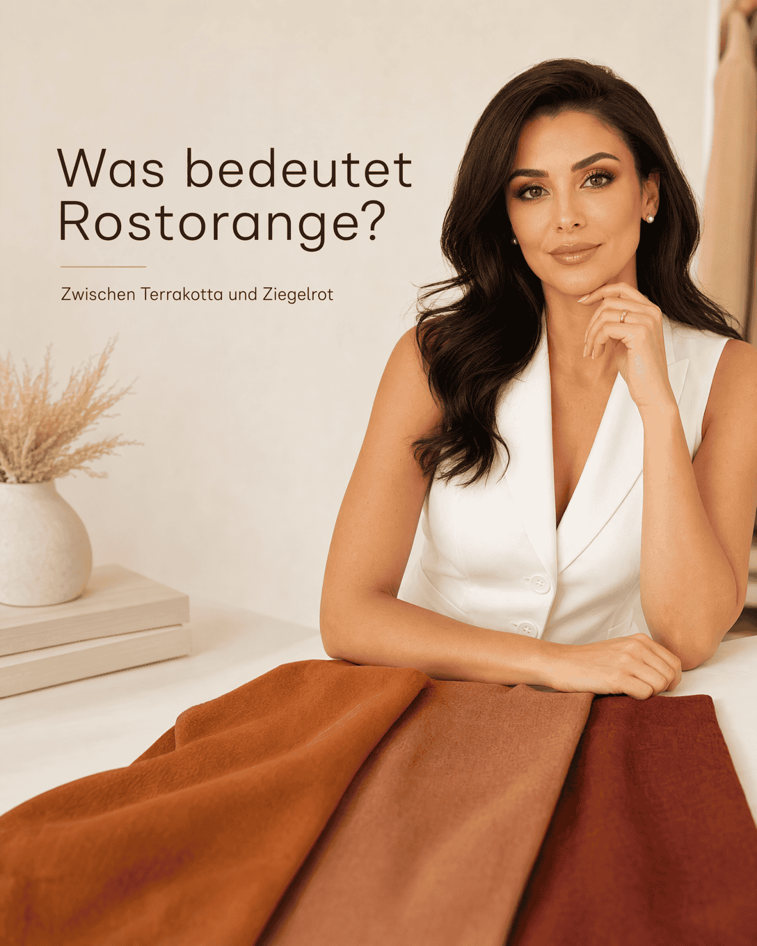
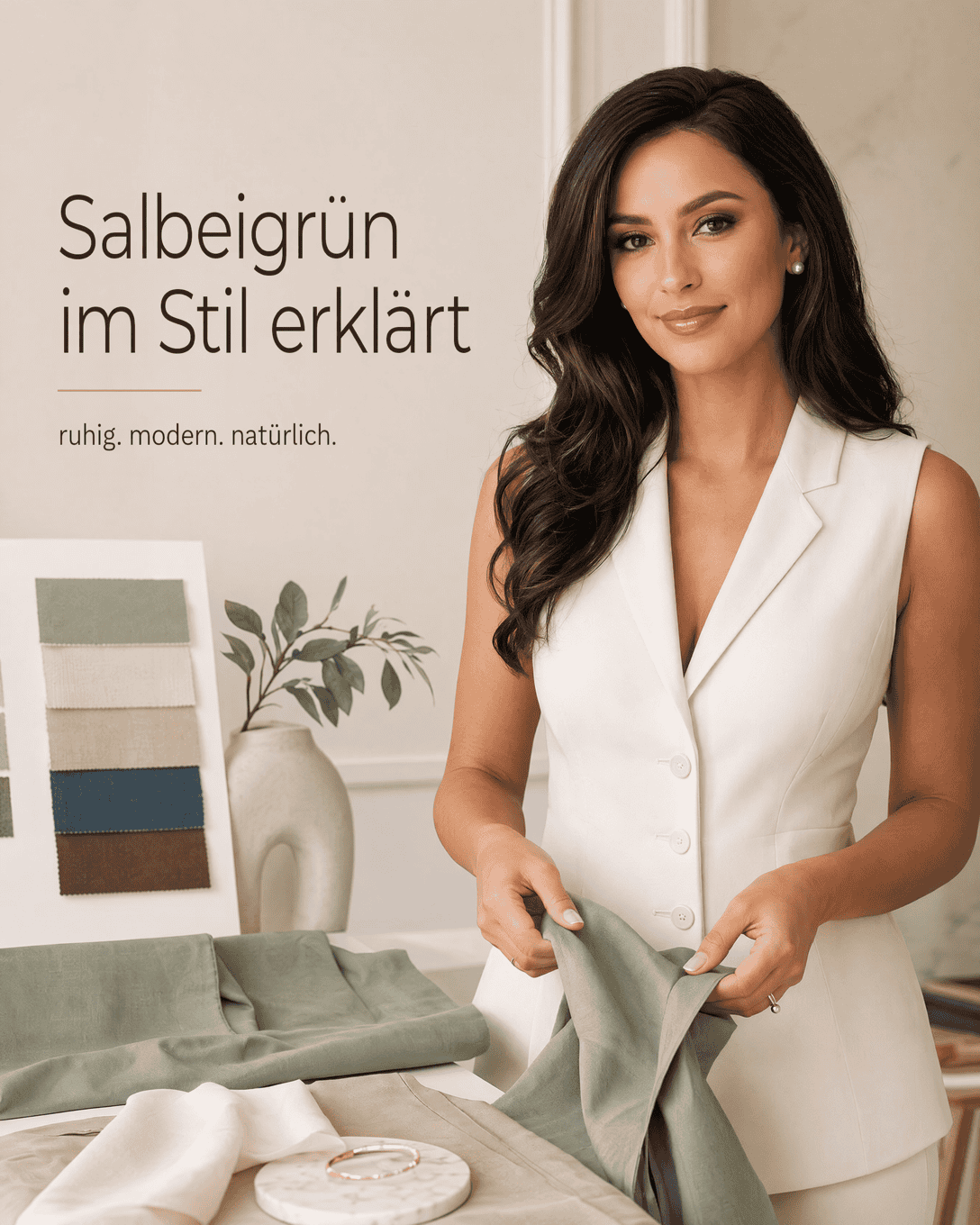
The Color Lexicon collects individual fashion colors and color families, including navy , terracotta , cream , camel , petrol blue , off-white , and many more.
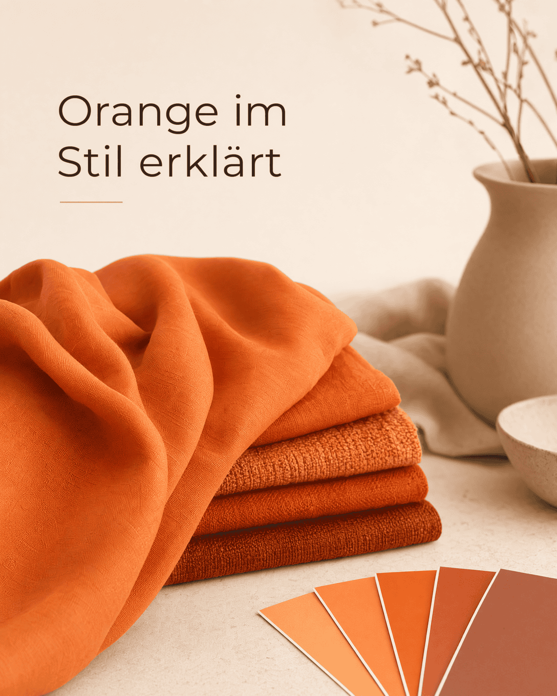
It helps you put a precise name to a shade, distinguish close alternatives, and make more intentional choices when building outfits or shopping. This matters because beige, ecru, sand, and cream may all appear light and neutral, yet create very different impressions beside the face or next to other garments.
How to read color names in fashion
A color name is a starting point, not a guarantee. The same named shade can look noticeably different depending on the fabric, dyeing process, lighting, and adjacent colors.
When comparing colors, consider these four qualities:
- Temperature: Does the shade read warm, cool, neutral, or olive? See Color Temperature .
- Lightness: Is it pale, medium, deep, or dark? See Lightness .
- Saturation: Is the color clear and vivid, or soft and muted? See Saturation .
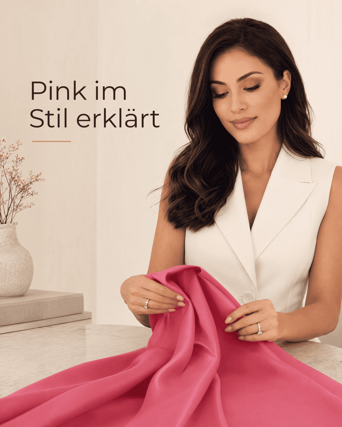
- Surface: Matte, glossy, textured, sheer, and brushed materials can change a color’s visible effect.
For example, a deep blue wool coat may look calm and serious, while a similarly colored satin blouse can look more luminous and expressive. The color may be related, but the overall effect is not identical.
Use color terms for better outfit planning
Precise color language makes outfit planning easier. Instead of deciding that an item is simply “brown,” you can identify it as chocolate brown, cognac, taupe, or camel. That distinction helps you find combinations that feel intentional rather than accidental.
A few useful comparisons include:
- Beige , ecru , and cream are light neutrals with different undertones.
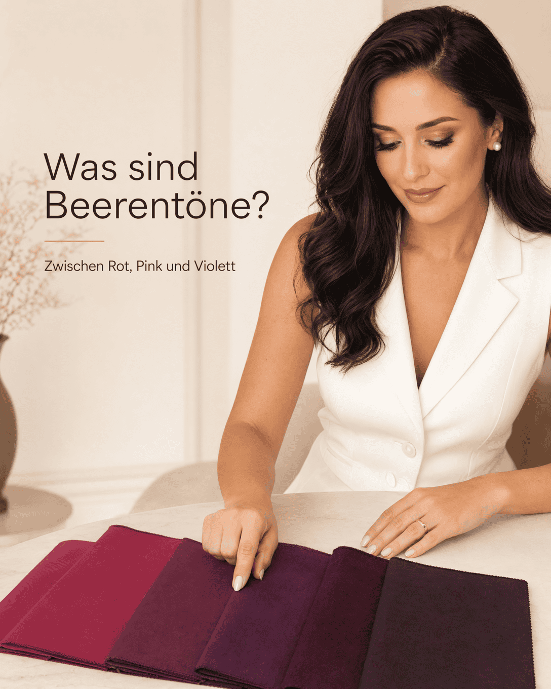
- Burgundy , berry tones, and aubergine belong to a dark red to purple area, but vary in depth and temperature.
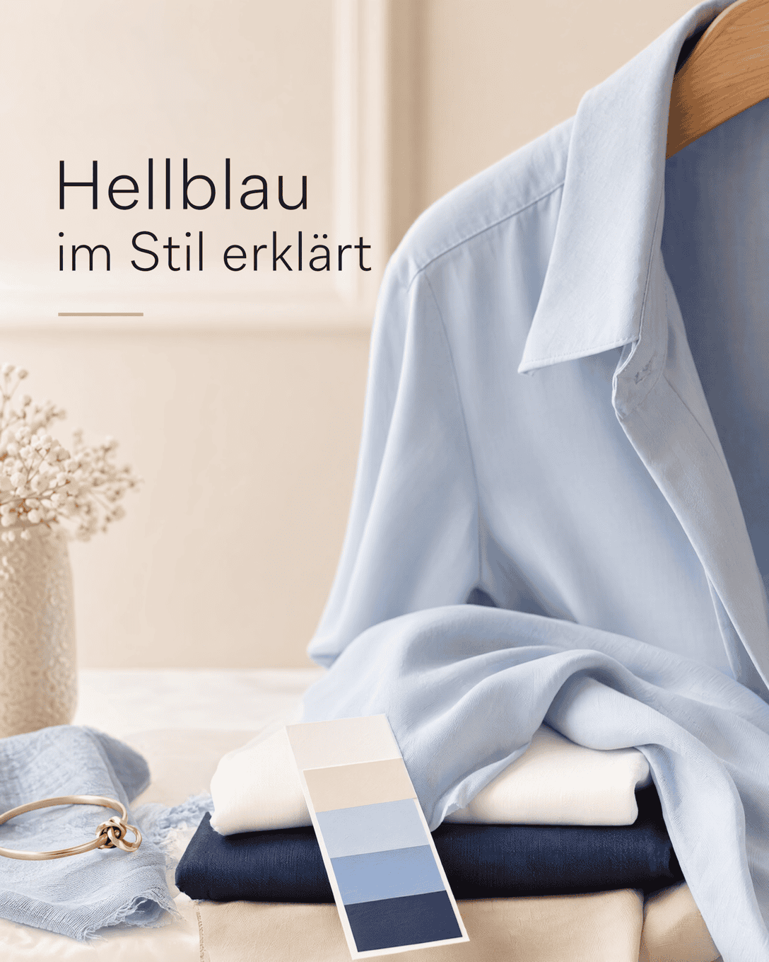
- Indigo and denim blue , navy, and royal blue each create a different level of contrast and formality.
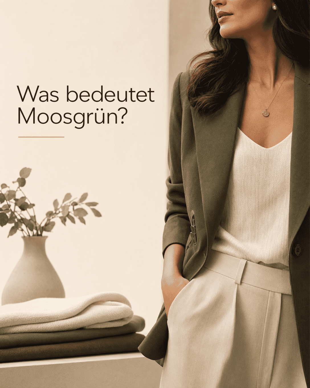
- Olive , moss green, and sage green all sit within the green family, but can feel earthy, muted, or fresh depending on their undertone and brightness.
Understanding these nuances also supports a more versatile Color Palette , particularly when you want new purchases to work with clothes you already own.
Practical color check before you buy
Do not rely on a product photo or color label alone. Try these checks when assessing a shade:
- Hold the garment near your face in daylight where possible.
- Compare it with colors you wear often, especially your preferred neutrals.
- Notice whether the color makes your complexion look clearer, duller, warmer, or more shadowed.
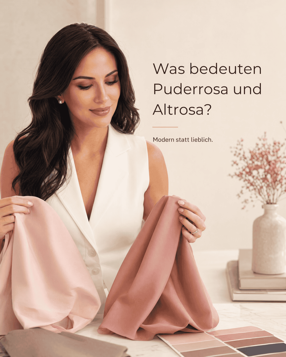
- Check how the fabric surface affects the shade. Satin , velvet , knitwear, and matte cotton reflect light differently.
- Consider the color’s role in the outfit. A shade that feels too strong in a coat may work beautifully as an Accent Color in a scarf, shoe, or bag.
Why color precision matters
Knowing color names helps you communicate what you are looking for, compare garments more accurately, and create clearer visual harmony. It can also reduce bad purchases: a “white” shirt that is actually a very cool pure white may not work with a wardrobe built around warm cream and camel tones.
For personal color direction, explore Color Consultation , Undertone , and Color Harmony .
Choose colors directly
Select a shade in the color wheel and jump directly to the matching term.
Color Lexicon 60